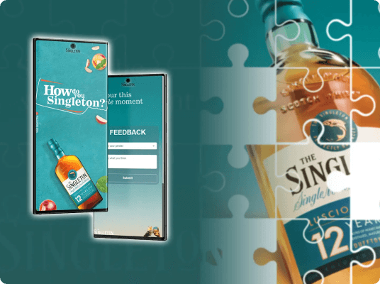
Web Apps - The Singleton Microsite
Branded event microsite that guides attendees, drives engagement, and captures real‑time feedback.
The Singleton Engagement Microsite was built for the How Do You Singleton 2024 event in Lagos as a lightweight, high‑impact engagement layer for on‑ground attendees. The product combined spatial orientation (interactive event map), experiential interaction (cocktail booking), and post‑event insight (feedback collection) into a single, mobile‑first web experience. Designed and built under tight time constraints, the microsite prioritized clarity, performance, and brand alignment while leveraging a pragmatic backend setup that allowed non‑technical stakeholders to manage and analyze event data with minimal friction.

 React JS
 Google App Scripts
 Figma
Figma Photoshop
Product Context
Singleton required a digital layer that complemented a physical brand experience, not a traditional marketing site, but a functional utility attendees would actively use during the event. The microsite needed to work instantly, without onboarding, accounts, or downloads, in an environment with variable connectivity and high usage concurrency.

User Problems
- Difficulty navigating a multi‑attraction event space
- Uncertainty around cocktail availability and booking status
- No clear channel to provide feedback post‑experience
Business Problems
- Need to guide attendee flow across attractions
- Capture engagement data for post‑event reporting
- Maintain premium brand perception under time pressure
Design Goals
- Zero‑learning‑curve interaction model
- Clear spatial orientation via visual mapping
- Minimal cognitive load across flows
- Strong brand presence without visual noise
Engineering Goals
- Ship a stable production app within one week
- Avoid backend infrastructure overhead
- Ensure mobile performance and reliability
- Enable non‑technical data access post‑event
Discovery & Product Strategy
Event microsites often fail by either being overly promotional or overly complex. The opportunity here was to act as a digital concierge: useful, contextual, and invisible when not needed. I looked conceptually at festival maps (static vs interactive), QR‑driven event utilities, and pop‑up microsites for brand activations. The key insight: successful experiences minimize navigation depth and surface value immediately.
Core UX Hypotheses
- A single‑page, vertically segmented layout would outperform multi‑page navigation
- Visual maps would reduce staff dependency for directions
- Real‑time booking feedback would increase trust

Product Scope Definition
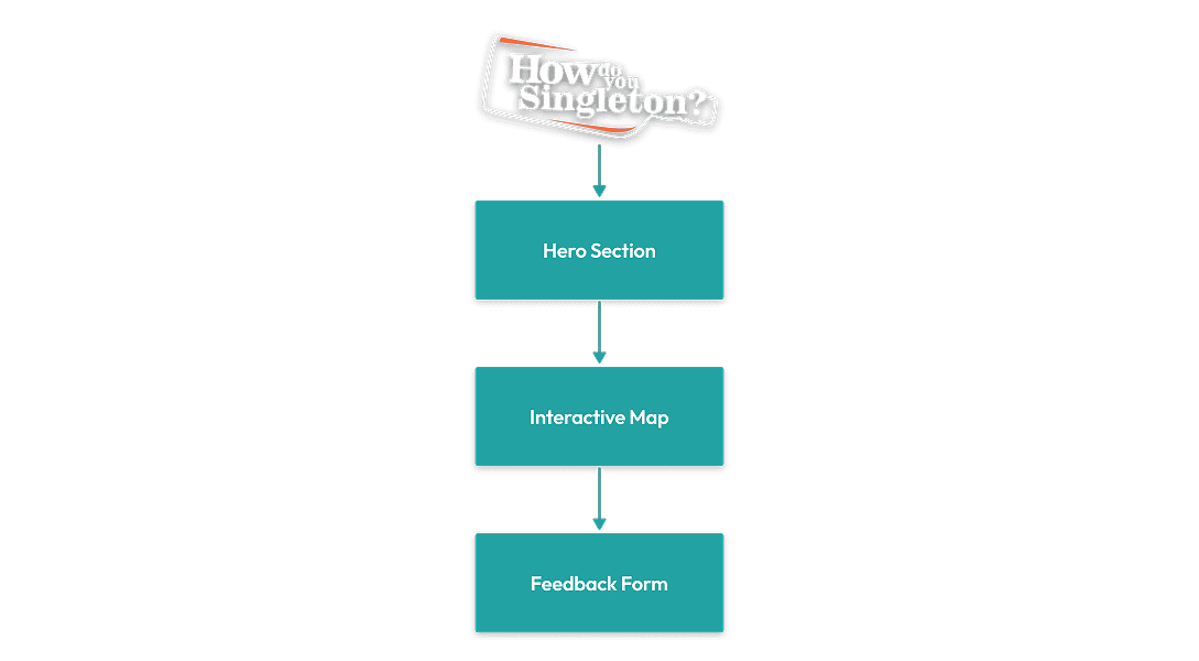
Deliberately constrained to three core sections, each designed to complete in under 60 seconds:
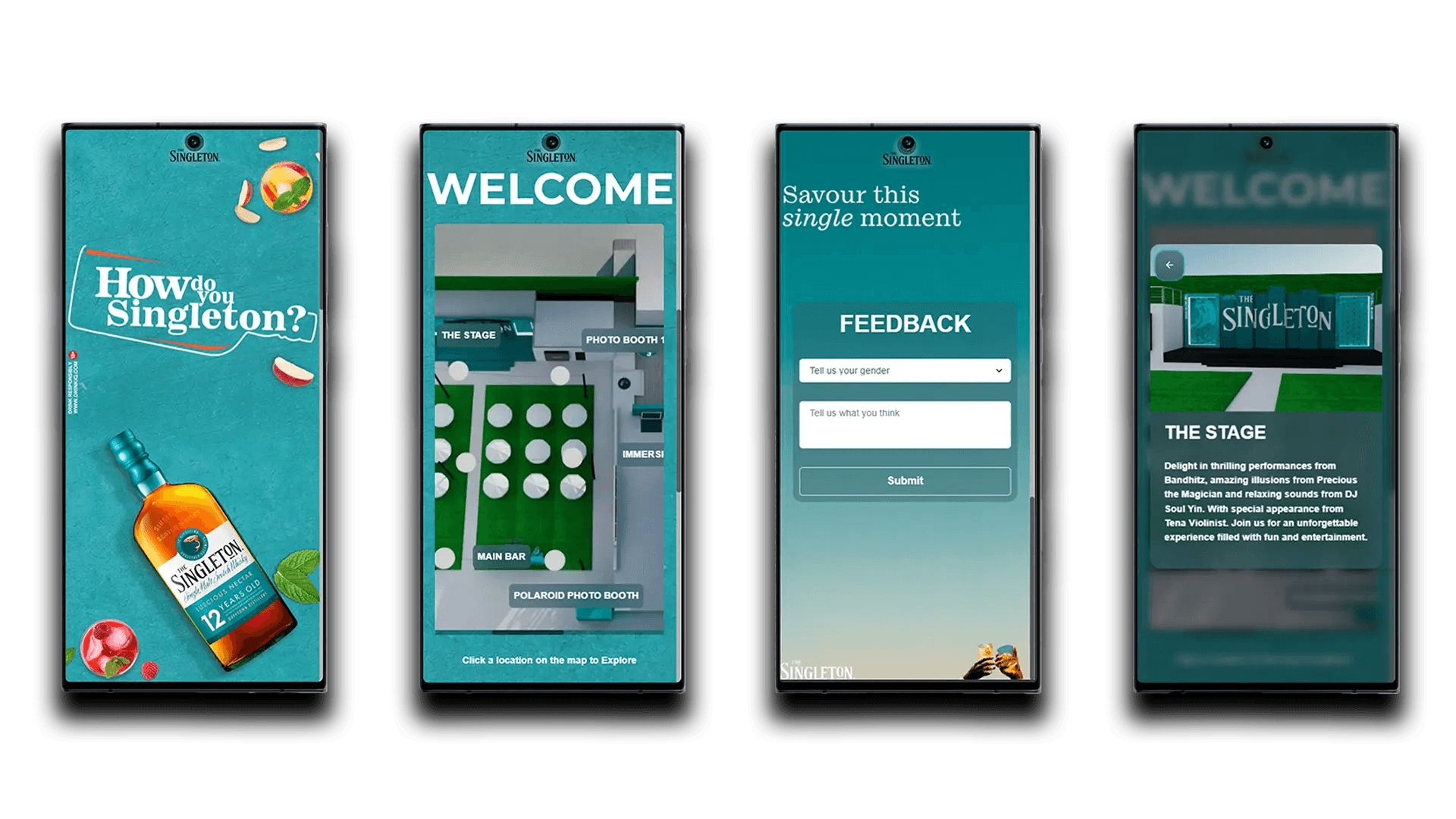
Orientation
Entry point with brand context and event overview
Navigation
Interactive map with attraction hotspots and booking
Feedback
Post-experience insight collection
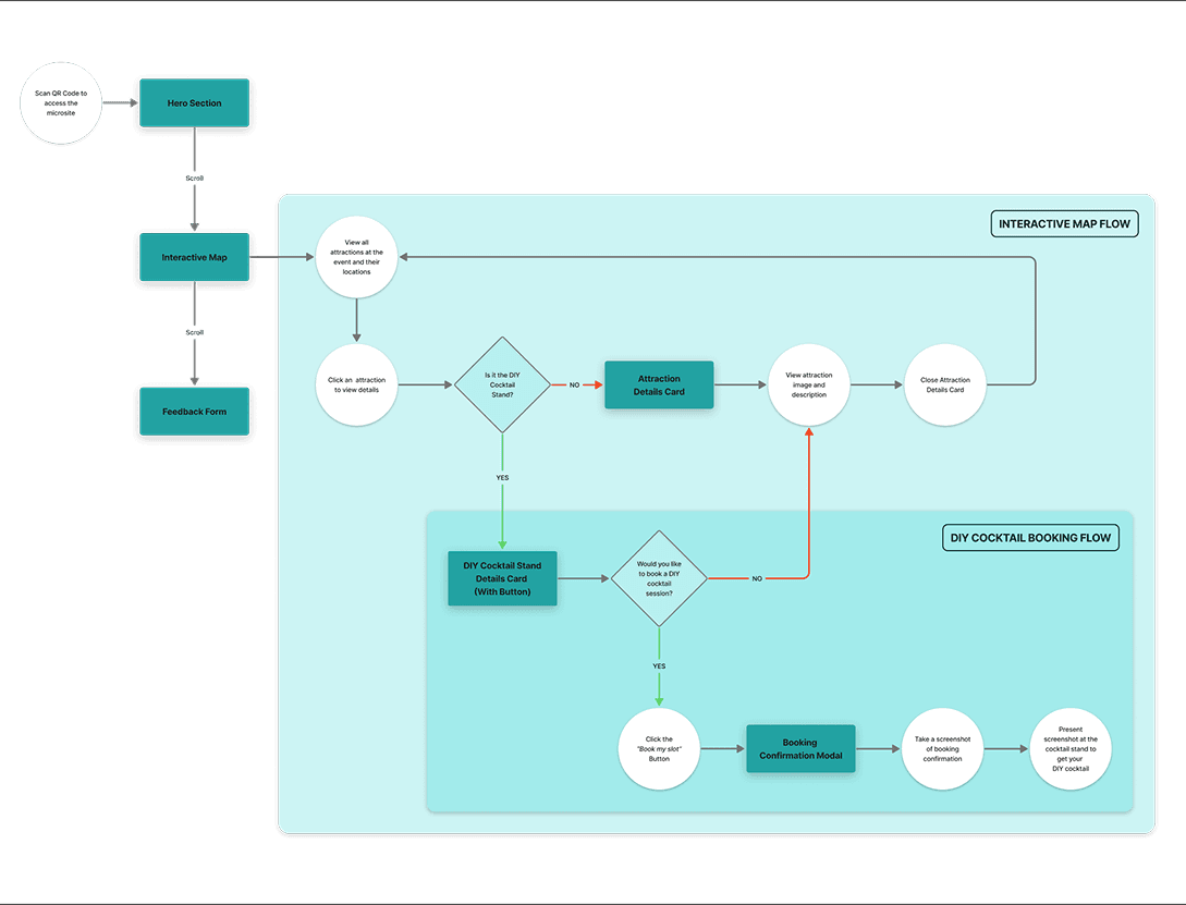
Design Strategy & User Flow
Intuitive navigation was ensured through carefully mapped user flows and a clear information architecture. Snap scrolling was used to reinforce section boundaries without introducing menus. After these foundations, I designed precise assets and crafted intuitive interaction patterns that kept users engaged and efficient.
Design System
- Typography hierarchy aligned to campaign assets
- Controlled color usage to maintain contrast
- Minimal iconography to avoid distraction
Interaction Patterns
- Tap‑based interactions only
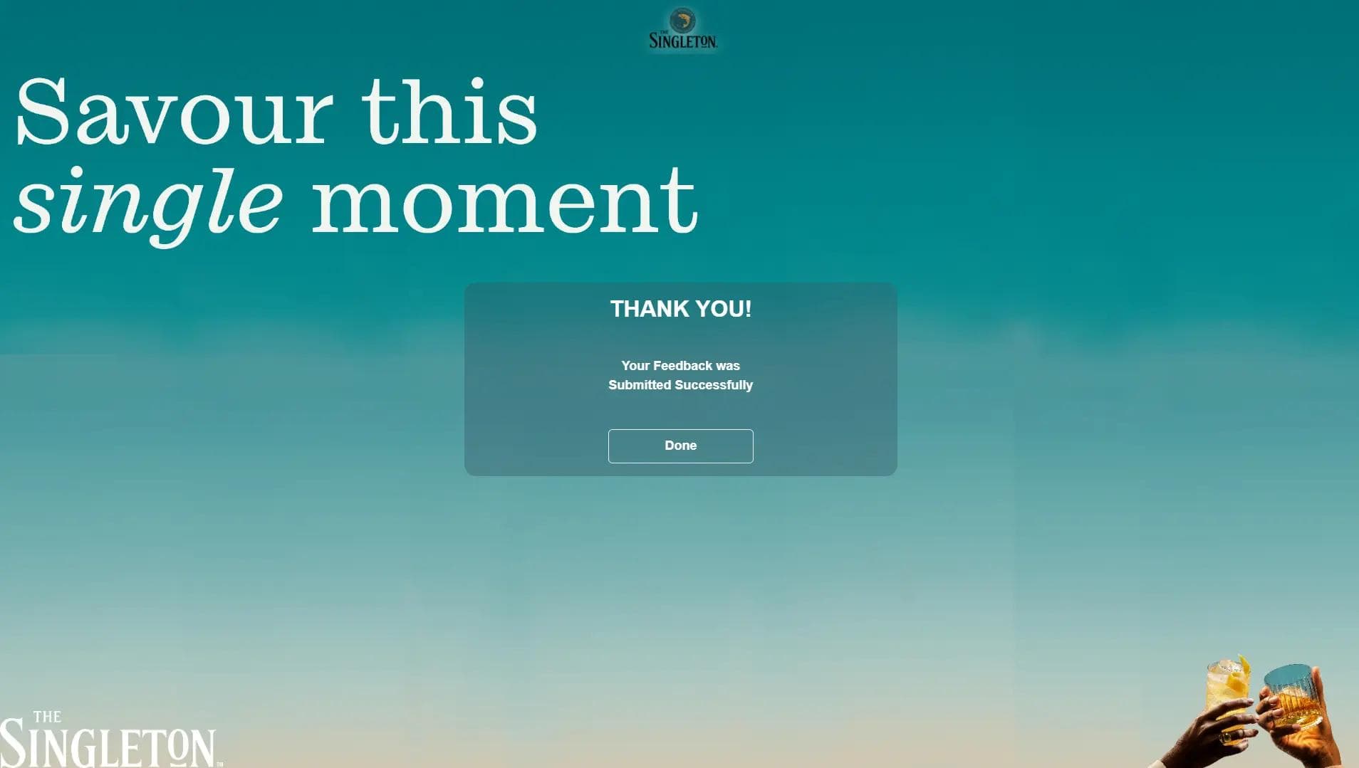
- Immediate visual confirmation on submissions
- Disabled states to prevent duplicate bookings
- Large tap targets and clear focus states
Code Architecture & API Structure
The app was built as a single‑page React application with section‑based rendering and minimal routing overhead. The data layer is seamlessly integrated using Google Sheets and custom Google Scripts APIs. I prioritized simplicity, ensuring optimal performance while balancing design and engineering trade-offs. Components were designed for clarity over abstraction due to limited reuse needs.
Data Integration via Google Sheets API
- Instead of a traditional backend, the app leverages Google Sheets as a lightweight database, with custom Google Scripts APIs handling real-time data fetching and updates.
Performance
- Asset compression for mobile, minimal JavaScript bundle size, and avoidance of unnecessary re‑renders ensured fast load times.
Design–Engineering Tradeoffs
- Design decisions favored layout and interaction simplicity, directly reducing engineering overhead. Backend limitations shaped real‑time interaction patterns and eliminated features requiring complex validation.
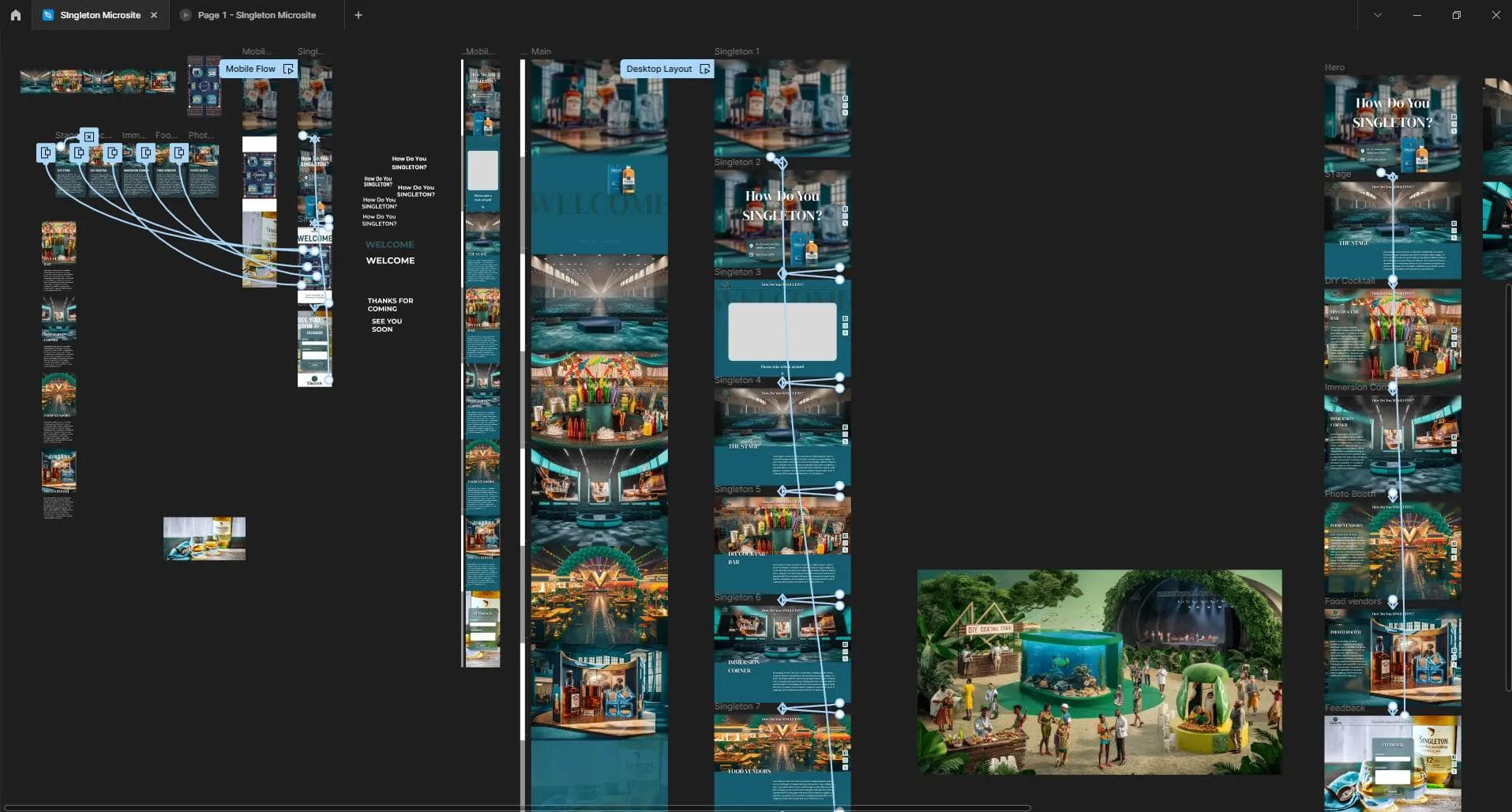
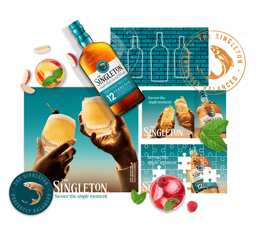
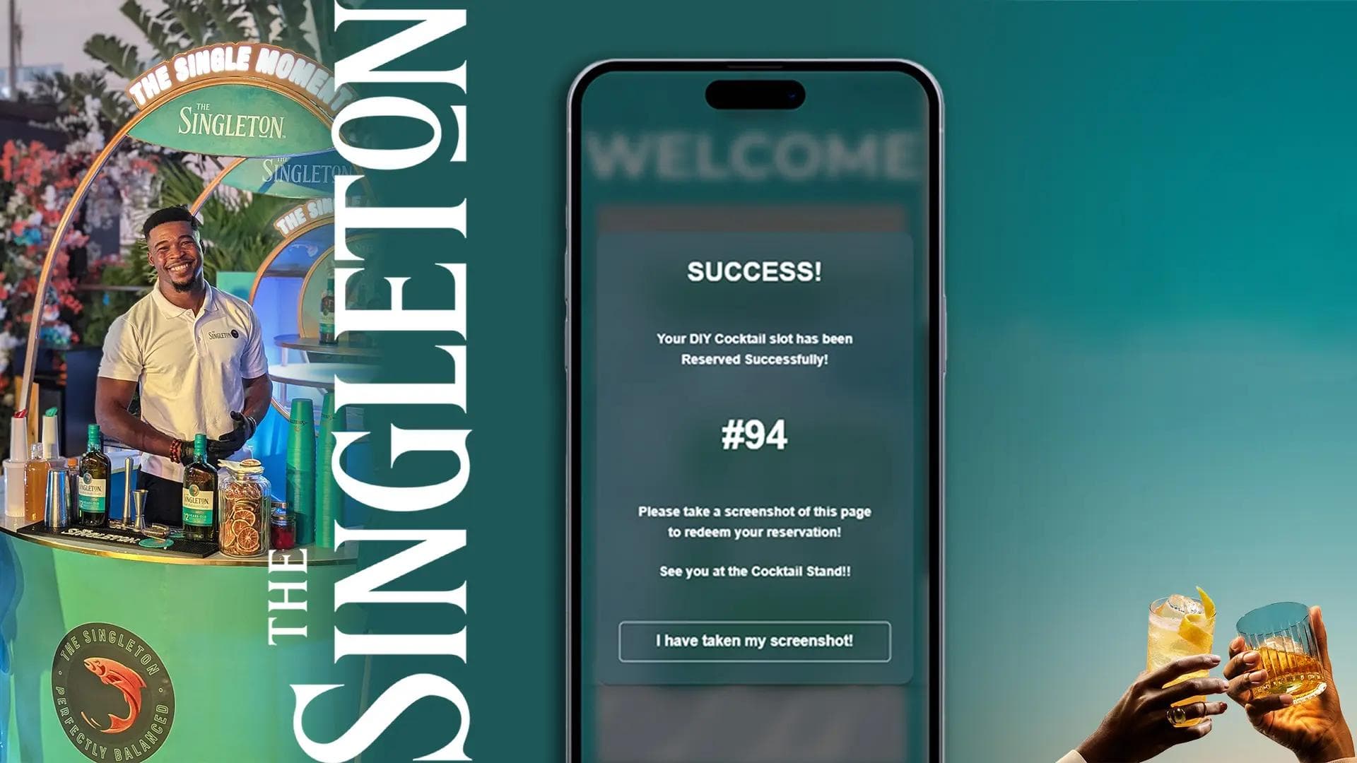
The Finished Product
The final app is a streamlined event platform, designed for clarity and ease. Below, you’ll find a selection of key screens, event media, and a link to explore the live app and experience the event firsthand.
Outcome & Impact
A reliable, branded engagement tool was successfully deployed and used during a live event with hundreds of concurrent users. The microsite operated without critical runtime issues throughout the event duration.
Problem Resolution
1
Reduced attendee confusion through clear spatial mapping
2
Streamlined cocktail booking and management flow
3
Captured actionable feedback for post‑event analysis
Key Takeaway
This project demonstrates full product ownership, balancing UX clarity, brand integrity, and engineering pragmatism to deliver a real‑world solution under production constraints. The microsite succeeded not through complexity, but through focused execution on a tightly scoped problem.

What Worked Well
- Design Under Constraint. Every design decision had to justify its implementation cost.
- Pragmatic Technology Choices. Using Google Sheets as a backend proved to be the right call for this context, as and the spreadsheet interface gave stakeholders immediate, familiar access to event data.
- Owning both design and engineering enabled rapid iteration without handoff friction.