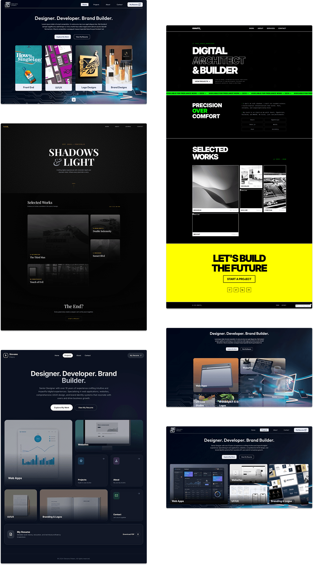
Web Apps - Stevano’s Design Portfolio
A CMS-Driven, Performance-Optimized Portfolio Engine Built to Scale Personal Branding
Stevano’s Design Portfolio is a fully dynamic, CMS-powered web application built to showcase design and development projects in a scalable, future-proof way. Rather than being a static portfolio site, it functions as a content-driven product system where projects, categories, themes, and metadata are structured in Sanity CMS and rendered dynamically via Next.js App Router using modern performance and SEO strategies.

 Next JS
 Typescript
 Sassy CSS
 Sanity CMS
 Motion.dev
 Cursor
 Figma
Figma Figma Make
 Google Stitch
 Magic Patterns
Product Context
This portfolio consolidates my design and development work in one modern, maintainable platform. Previous solutions lacked the maturity needed for professional branding, static layouts made updates cumbersome and didn't reflect my current capabilities. The site targets recruiters, prospective clients, and fellow designers who need to quickly assess both craft quality and technical depth.

User Problems
- Recruiters need quick access to relevant work samples and technical capabilities
- Clients struggle to assess design quality and project scope from static resumes
- Designers visiting portfolios expect modern visual patterns and smooth interactions
Business Problems
- Outdated portfolio websites fail to communicate current skill level and project range
- Manual HTML updates for new projects create friction and delay showcasing recent work
- Poor SEO visibility limits discoverability by recruiters searching for designers
- Static presentations lack the flexibility to highlight different work for different audiences
Design Goals
- Establish professional brand identity through contemporary layout systems and visual polish
- Showcase project depth and technical range without requiring deep navigation
- Create distinct visual experiences per project while maintaining cohesive system
- Balance immersive presentation with practical information density
Engineering Goals
- Enable non-technical project updates through structured CMS without touching code
- Optimize asset delivery and page performance for competitive load times
- Build dynamic routing that scales with growing project catalog
- Implement SEO foundations for organic recruiter discovery
Discovery & Product Strategy
The portfolio needed to solve three core problems: outdated personal branding, inefficient project management, and lack of content scalability. Existing portfolio sites felt static and required code changes for every update, creating friction between design iteration and deployment. The target audience can be split into two distinct groups: recruiters scanning for credibility and technical depth, and clients evaluating craft and communication style. Both need immediate visual impact paired with detailed project narratives, but consume content differently based on intent.
Core UX Hypotheses
- Bento grid layouts signal modern design fluency without sacrificing content density
- Dynamic color schemes per project increase memorability and brand association
- Editorial-style project pages build narrative depth that portfolios typically lack
- Headless CMS separation lets design iteration happen independent of content updates
- Glassmorphism and subtle motion establish professional maturity over flashy interaction

Product Scope Definition
The portfolio needed to balance visual impact with practical content management, building a system that could evolve without constant code edits while maintaining design integrity across dynamic project data.
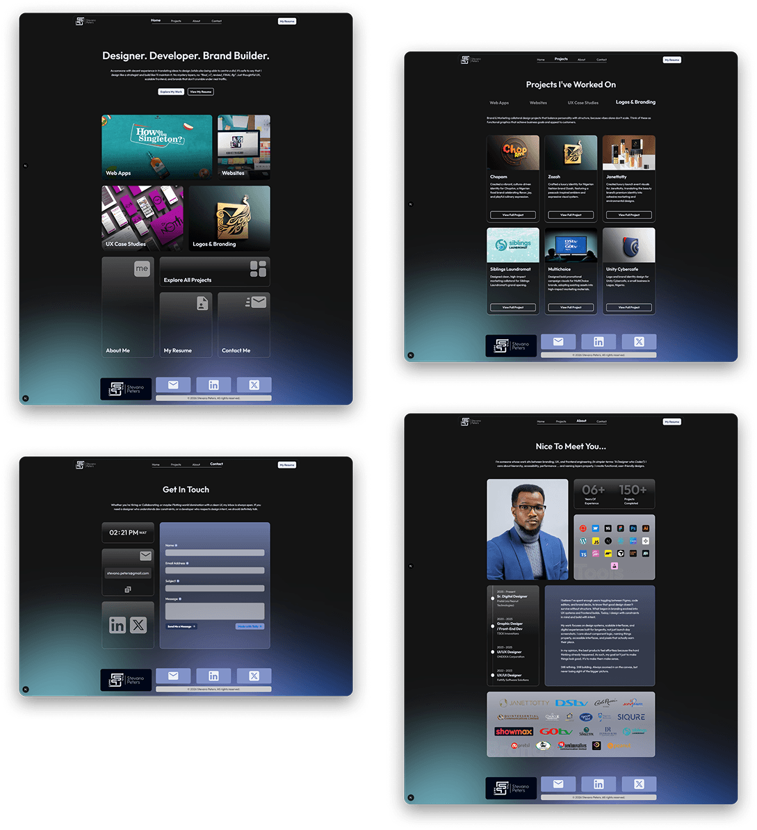
Core Experience
Bento grid layouts for top-level pages, editorial-style project detail pages, dynamic color schemes pulled from project metadata, seamless navigation between categories and individual works.
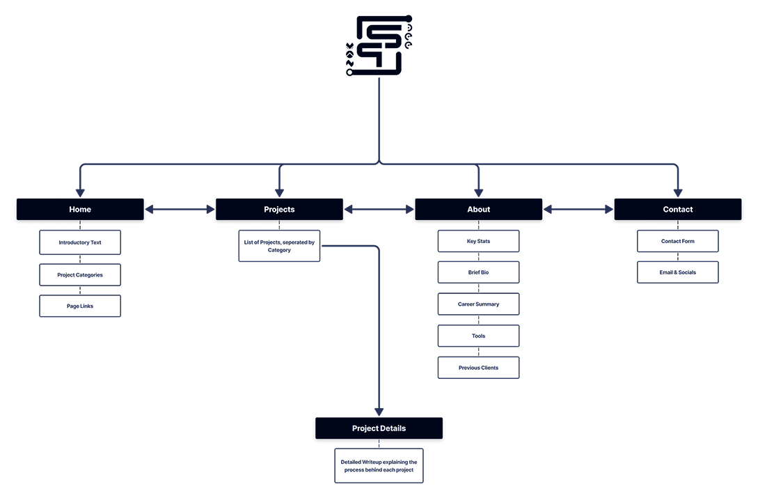
Content Architecture
Four primary routes (Home, Projects, About, Contact) with dynamic sub-routing for project categories and detail pages, all content managed through Sanity CMS to enable updates without touching the codebase.
Technical Foundation
Next.js App Router for server-side rendering and SEO, TypeScript for type safety, SCSS for maintainable styling, Motion.dev for subtle animations, Sanity CMS as headless backend with GROQ queries for data fetching.
Performance Strategy
Sanity CDN for asset delivery, automatic WebP conversion for images, Next.js Image component for optimization, caching layer for faster project loads, responsive grid system using CSS Grid with adjusted spans.
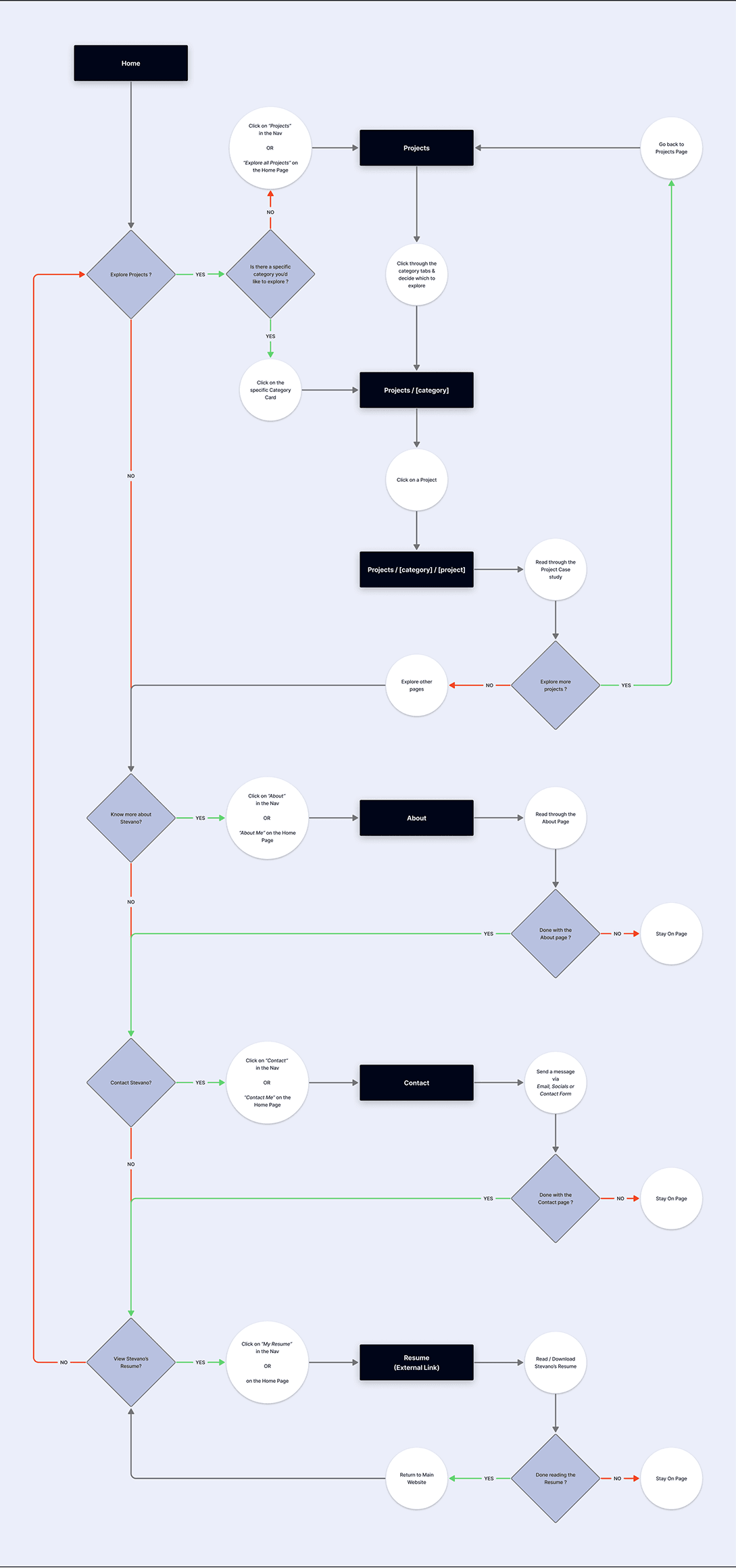
Design Strategy & User Flow
The portfolio needed to serve the aforementioned target audience, while maintaining my creative voice. I structured the experience around progressive disclosure: bento grids on landing surfaces for quick scanning & editorial layouts on project pages for depth. Users enter through the home page's bento grid showcasing featured work categories. Navigation remains persistent across top-level pages (Projects, About, Contact, Resume). From any category card, users drill into filtered project views, then into individual case studies. Each project page uses dynamic routing (/projects/[category]/[project]) and pulls its own color scheme from Sanity CMS, creating visual variety without manual theming.
Bento Grid as Content Hierarchy
- Varying card sizes are used to arrange information across surface level pages. This replaces traditional carousel patterns that bury content behind interaction.
Dynamic Color Systems per Project
- Each case study extracts its primary brand color from Sanity and applies it to headers, accents, and glassmorphic overlays. Projects feel distinct without requiring separate design files.
Editorial Layout for Case Studies
- Project pages mimic longform editorial design: full-bleed images, asymmetric text blocks, generous whitespace. This shifts tone from portfolio to publication, encouraging deeper reads.
Glassmorphism for Depth Without Weight
- Frosted overlays on cards create layering while maintaining readability over dynamic backgrounds. This pairs with subtle motion (for example; hover lifts) to signal interactivity without distraction.
Responsive Grid Reconfiguration
- Rather than hiding elements at smaller breakpoints, cards reflow by adjusting grid row/column spans.
Category-Driven Navigation
- Projects self-organize by type (branding, web, product) via Sanity taxonomy. Home page surfaces these groupings as navigable cards, letting users filter by interest before committing to a project.
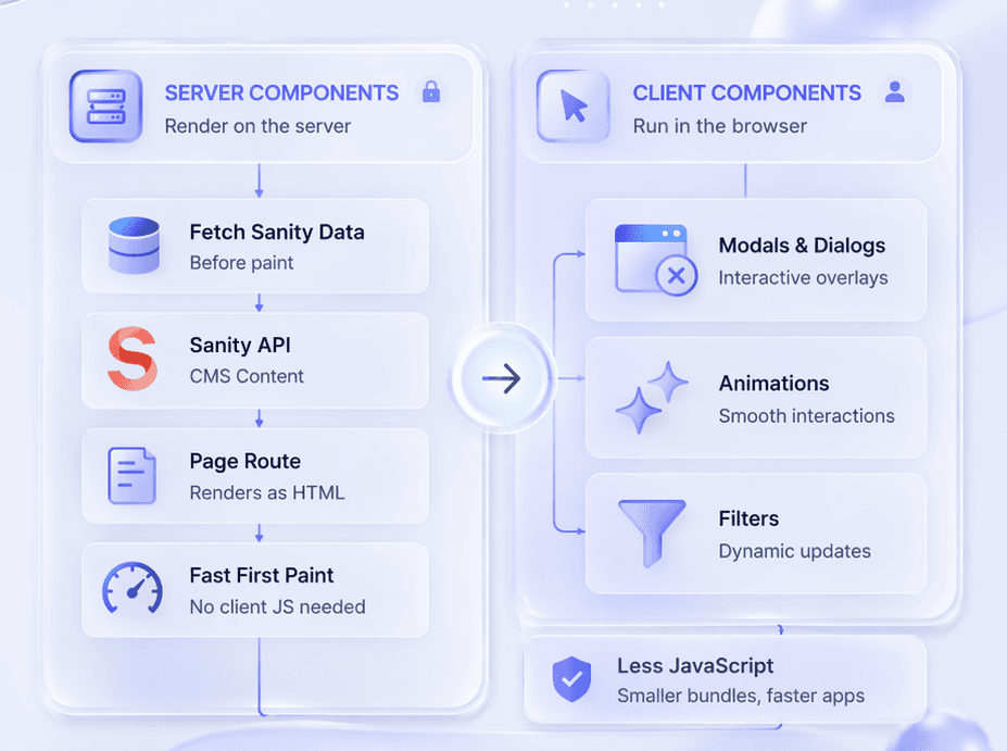
Code Architecture & API Structure
The architecture centers on Next.js App Router conventions, separating server and client boundaries to optimize data fetching and interactivity. Sanity CMS functions as a headless backend, queried via GROQ at build time and on-demand for dynamic project routes.
Server & Client Component Split
- Page-level routes render as server components to fetch Sanity data before paint. Interactive UI elements (modals, animations, filters) isolate as client components to minimize JavaScript shipped to the browser.
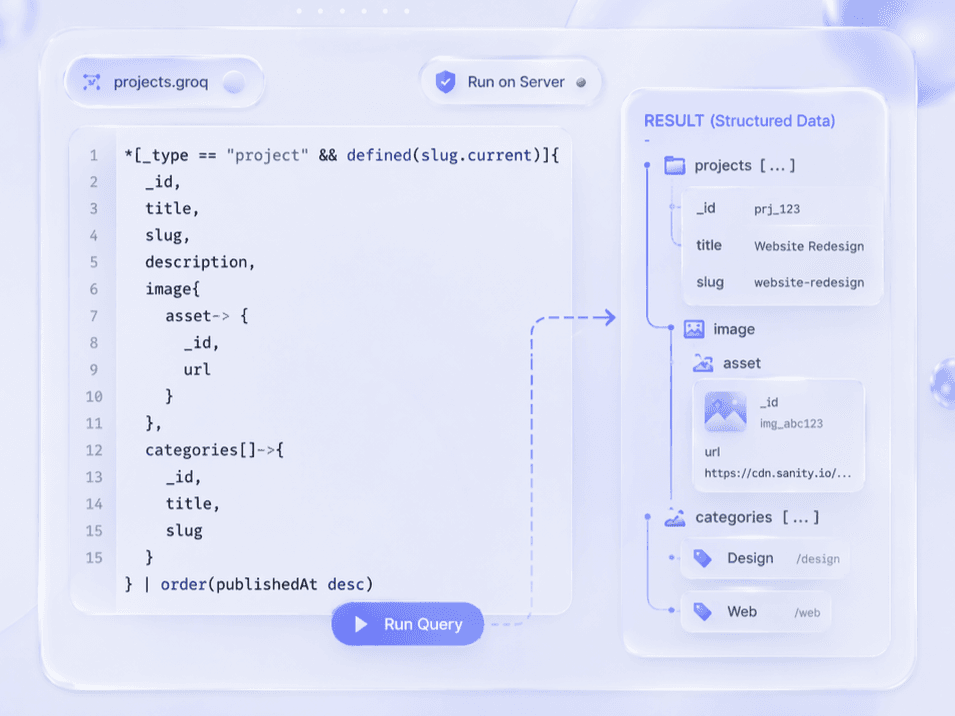
GROQ Query Layer
- Sanity queries run asynchronously in server components, pulling structured project objects with nested categories and asset references. This removes the need for REST endpoints or GraphQL resolvers.
Dynamic Route Generation
- The /projects/[category]/[slug] structure leverages Next.js generateStaticParams to pre-render every project page at build time. Incremental Static Regeneration handles new entries without full redeploys.
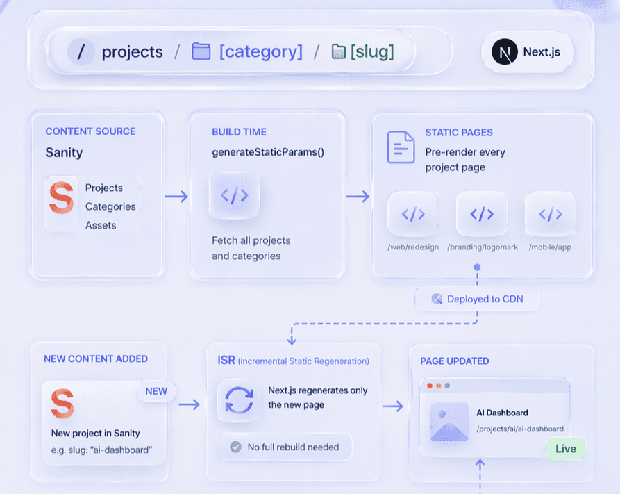
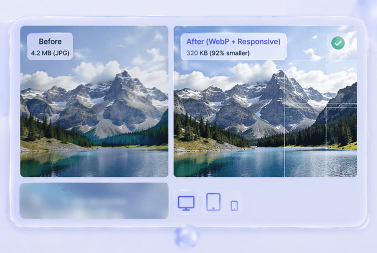
Image Optimization Pipeline
- Sanity's CDN auto-converts uploads to WebP and serves responsive srcsets. Next.js Image components consume these URLs with lazy loading and blur placeholders to defer offscreen assets.
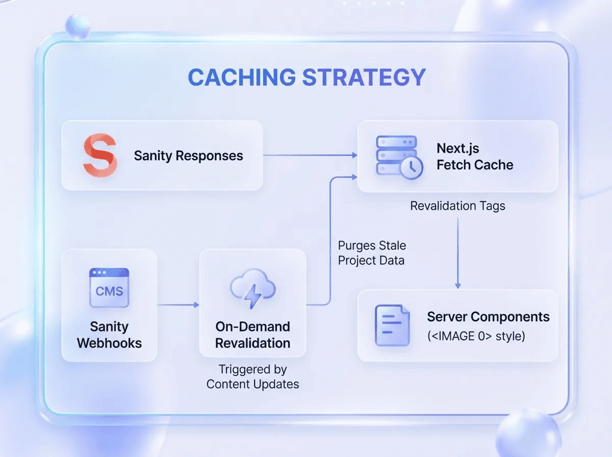
Caching Strategy
- Sanity responses cache via Next.js fetch with revalidation tags. On-demand revalidation triggered by Sanity webhooks purges stale project data when content updates in the CMS.
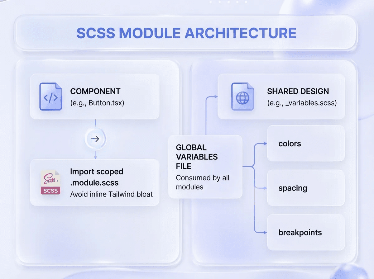
SCSS Module Architecture
- Each component imports a scoped .module.scss file to avoid inline Tailwind bloat. Shared design tokens (colors, spacing, breakpoints) live in a global variables file consumed by all modules.
The Finished Product
The portfolio launched as a full-stack web app that dynamically showcases design and development work through a bento grid interface with glassmorphism styling. Each project page generates from Sanity CMS, allowing updates without touching code while maintaining fast load times through NextJS optimization and CDN delivery.
Outcome & Impact
The portfolio achieved its core objective: a scalable, CMS-driven platform that eliminates code edits for future project updates. The shift from a full-screen immersive layout to a scrollable Bento grid resolved the impracticality of static layouts while maintaining visual impact through glassmorphism and dynamic color schemes.
Problem Resolution
1
CMS integration enables project updates without touching codebase
2
Bento grid layout replaced impractical full-screen design
3
Dynamic routing generates individual project pages automatically
4
Performance optimizations ensure fast load times via caching and CDN
5
Responsive strategy adapts grid spans across all screen sizes
6
Editorial project pages provide depth while top pages offer overview
Key Takeaway
Building a portfolio forced me to treat myself as a client, balancing aspirational design with practical constraints. The shift from a fullscreen immersive concept to a scrollable Bento grid taught me that great design isn't about rigidity; it's about knowing when to adapt for scalability and real-world content needs.

What Worked Well
- The headless CMS delivered exactly what was needed, effortless project updates without touching code, plus automatic image optimization and CDN delivery.
- Abandoning the initial immersive no-scroll concept mid-project proved essential. The scrollable bento grid handled dynamic content far better and improved real-world usability.
- Server-side rendering improved SEO for recruiter discoverability, while TypeScript caught errors early. The App Router kept data fetching clean and component boundaries clear.