UX Case Studies - Vee Cinemas
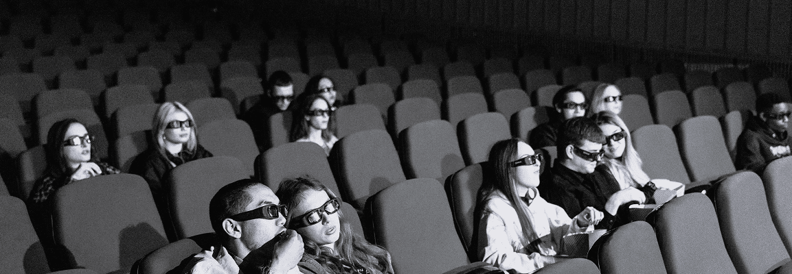
Eliminating Cinema Queues Through a Seamless Mobile Booking Experience
Vee Cinemas is a mobile-first ticketing and snack pre-ordering app designed to reduce in-cinema waiting time and improve the overall movie-going experience. The product allows users to Browse movies and showtimes, Purchase tickets, Pre-order snacks, Access and manage booked tickets. The core objective was to reduce friction before the movie begins, ensuring users spend less time in queues and more time enjoying their cinema experience.

 Figma
Figma Photoshop
Why I Designed This
Cinema queues in Nigeria are often long, especially during blockbuster weekends. Users frequently arrive early but still miss trailers or opening scenes due to Slow ticket processing, Snack purchase bottlenecks and other delays at the counter. The opportunity here is streamlining the entire pre-movie experience into a frictionless mobile flow.

WHO'S THIS APP FOR ?
Market Research
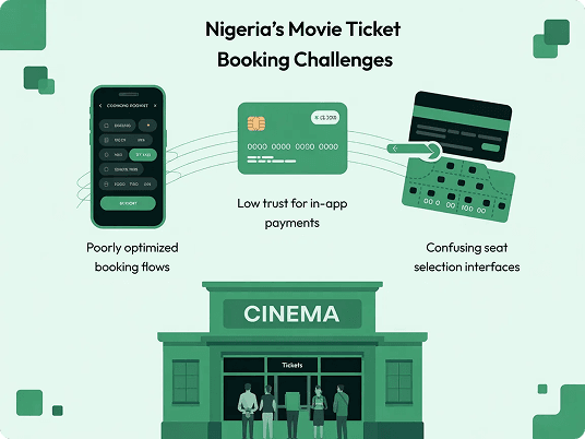
In Nigeria, cinema culture is social and event-driven. Most users purchase tickets physically at the cinema, even when online booking options exist. Key friction observed: Low trust for in-app payments, Poorly optimized booking flows, Confusing seat selection interfaces. This revealed a usability gap, not a demand gap.
Competitive Analysis
To better understand the current landscape of cinema ticket booking experiences in Nigeria, I evaluated the digital platforms of major cinema operators including Filmhouse Cinemas and Genesis Deluxe Cinemas. The goal of this analysis was to identify common usability patterns, strengths worth learning from, and friction points that could inform a more streamlined and user-friendly experience for Vee Cinemas.
Filmhouse Cinemas (Direct)
Pros: Well-structured movie listings and showtime organization make it easy for users to quickly browse currently showing films.
Cons: The booking flow involves multiple screens and transitions, creating friction and increasing the time required to complete a ticket purchase.

Genesis Deluxe Cinemas (Direct)
Pros: Clear movie details pages that provide users with helpful information such as runtime, ratings, and synopsis before booking.
Cons: Checkout steps feel disconnected, which can interrupt the user’s flow and create uncertainty during the purchase process.
Opportunities Identified
- Simplify the booking process to reduce the number of steps required to purchase tickets
- Maintain strong contextual awareness (e.g., cinema location) throughout the booking journey
- Integrate snack ordering naturally within the ticket purchase flow rather than as a separate process
- Use a mobile-first interaction pattern that mirrors familiar social media scrolling behaviors
- Provide an easily accessible location where users can retrieve their booked tickets quickly

User Survey
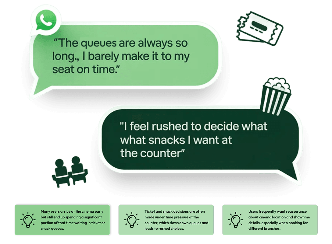
I conducted a series of informal discovery interviews with cinema-goers using WhatsApp. Participants included both frequent movie attendees and occasional visitors, allowing me to compare behaviors between users who regularly visit cinemas and those who only attend for major releases or social outings. The goal was to uncover real behavioral patterns around ticket purchasing, queue tolerance, and snack decisions, and identify where the current cinema experience creates friction before the movie even begins.
Assumptions validated
- Users want fewer steps, not more features
- Clear location context is critical
- Pre-ordering snacks is appealing if frictionless
- Users prefer vertical scrolling layouts (familiar from social apps)

Key Insights & Opportunity Areas
1
Many users arrive early but still spend a large portion of that time waiting in ticket or snack queues, which reduces anticipation and enjoyment before the movie begins.
2
Ticket counters often become bottlenecks because users are deciding seats, showtimes, and snacks simultaneously while standing in line.
3
Several interview participants mentioned confusion around cinema branches, particularly when booking for different locations in the same city.
Opportunity
Design a mobile-first booking flow that moves decision-making away from the cinema counter and into a fast, intuitive digital experience.
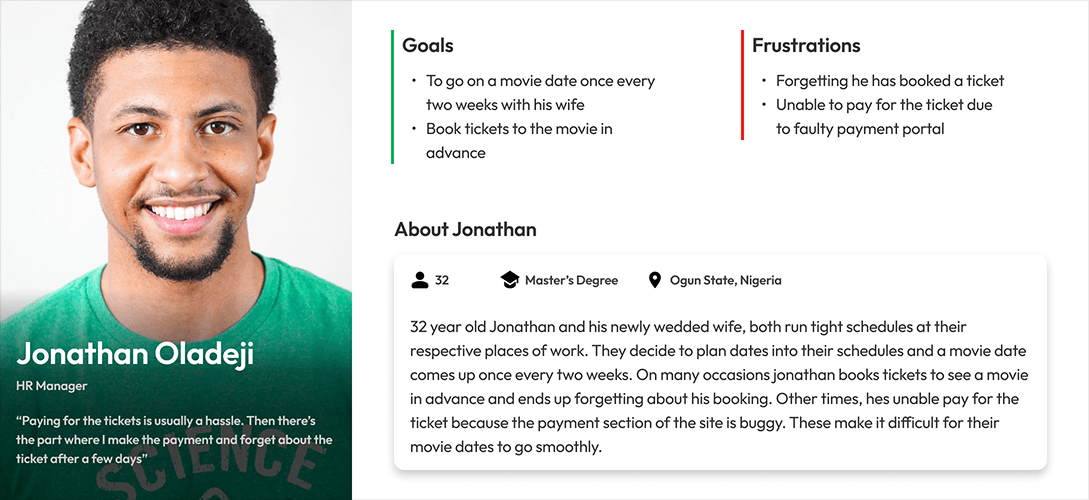
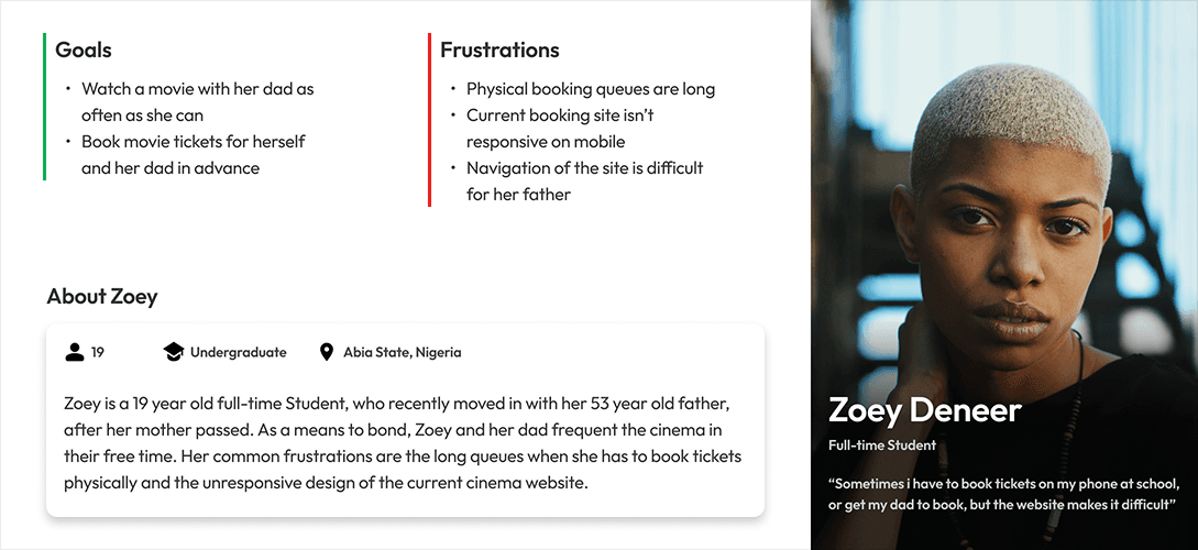
Personas
I translated the research insights into two lightweight personas representing the most common user behaviors observed during discovery interviews. These personas helped guide decisions around information hierarchy, booking flow simplicity, and reassurance mechanisms, ensuring the experience would work equally well for users planning group outings and those making quick solo bookings.
Research Summary
Cinema-goers lose valuable movie time standing in queues and navigating confusing booking systems.
UX Hypotheses
1
Simplified booking flows will reduce decision fatigue. Breaking the process into clear, progressive steps will allow users to focus on one decision at a time.
2
Persistent contextual cues will reduce user uncertainty. Clearly displaying the cinema location throughout the booking journey will prevent confusion when browsing multiple theaters.
3
Pre-order snack integration will reduce counter congestion. Allowing users to bundle concessions during checkout will eliminate a secondary queue at the snack bar and streamline the arrival experience.
STARTING THE DESIGN
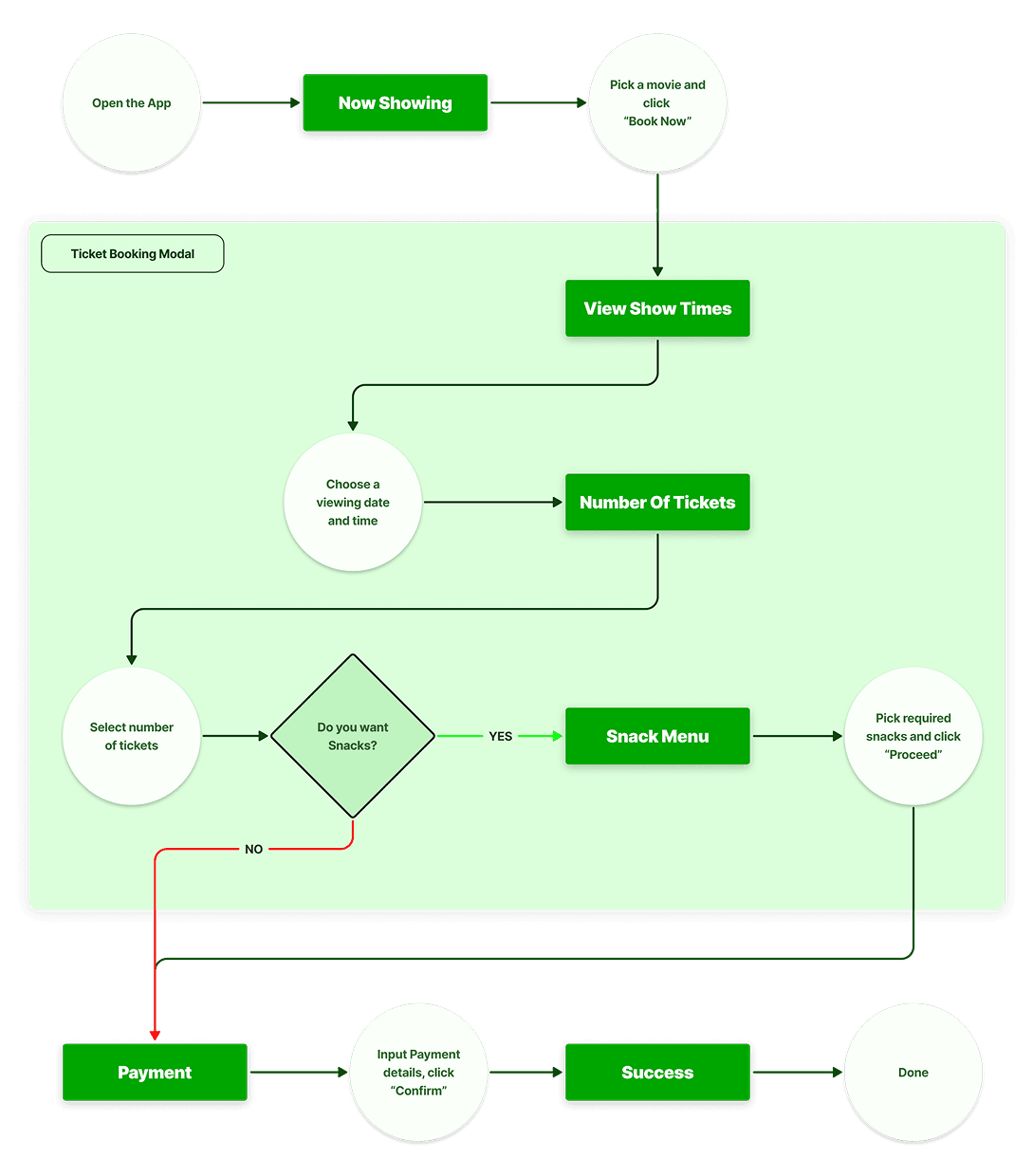
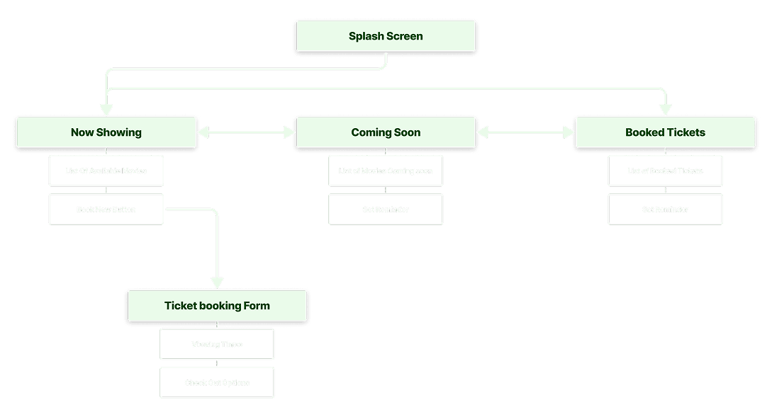
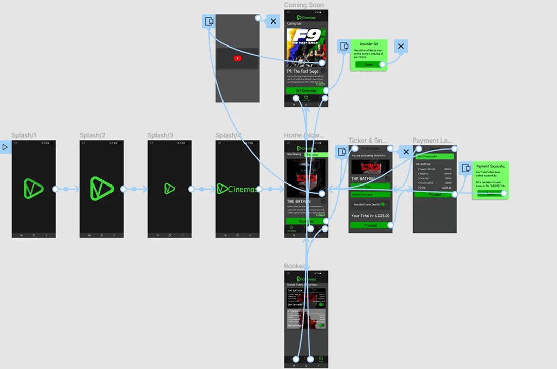
User Flow Diagram
The user flow was designed to map the simplest path from discovering a movie to completing a ticket purchase and accessing the booked ticket. The focus was on minimizing steps, maintaining clear context throughout the journey, and ensuring users could quickly move from browsing to checkout without unnecessary friction.
Information Architecture
The information architecture was structured to keep the experience lightweight and intuitive, prioritizing the most important actions for cinema-goers: discovering movies, purchasing tickets, and accessing booked tickets. Content and navigation were organized to support quick scanning and straightforward task completion on mobile devices.
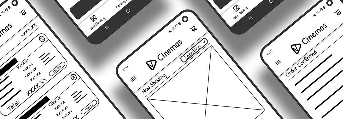
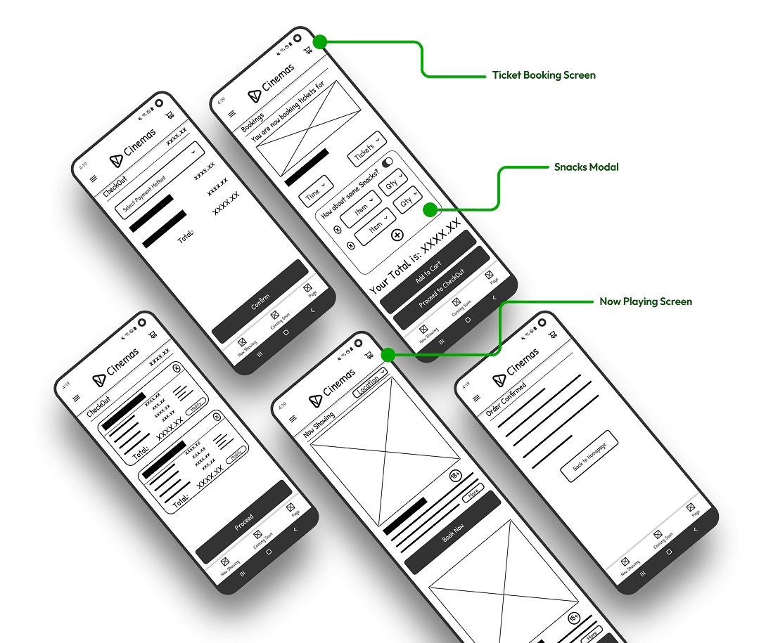
Low-Fidelity Wireframes
Low-fidelity wireframes were used to explore layout structure, screen hierarchy, and interaction patterns before moving into visual design. At this stage, the focus was on validating content placement, user flow clarity, and ensuring that key actions remained prominent and easy to access across the app.
REFINING THE DESIGN
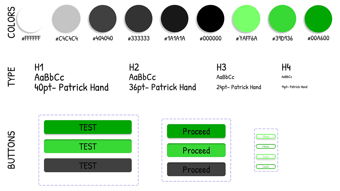
Style Guide
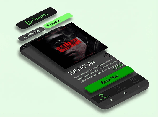
The visual language balances modern UI clarity with a playful tone to reflect the entertainment context. Core Pillars include a dark immersive theme, Vibrant green accent (#00A600) & Handwritten typography for personality and approachability. Main components include: Movie Cards, Snack Selectors & Confirmation Cards.
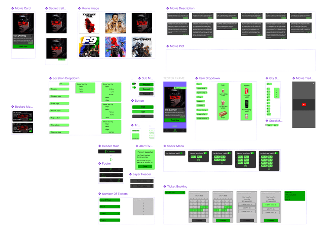
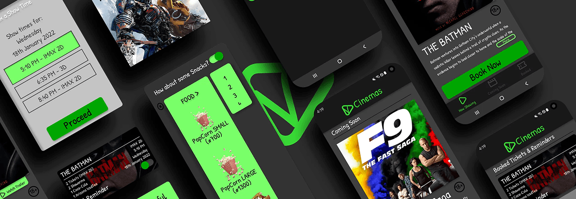
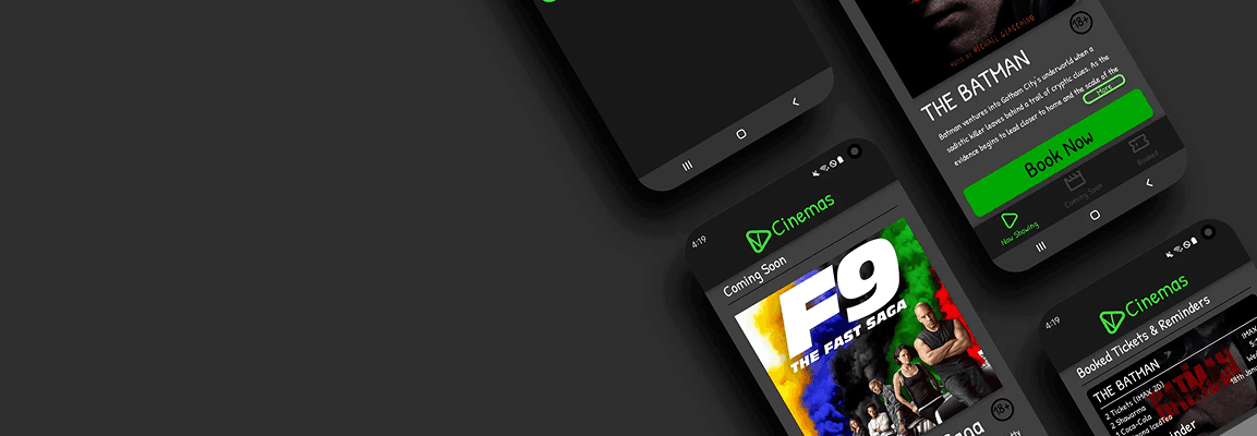
5 High fidelity mobile app designs were created
Key Screens Include:
- Home (Vertical movie listing)
- Snack Add-ons
- Checkout
- Booked Tickets
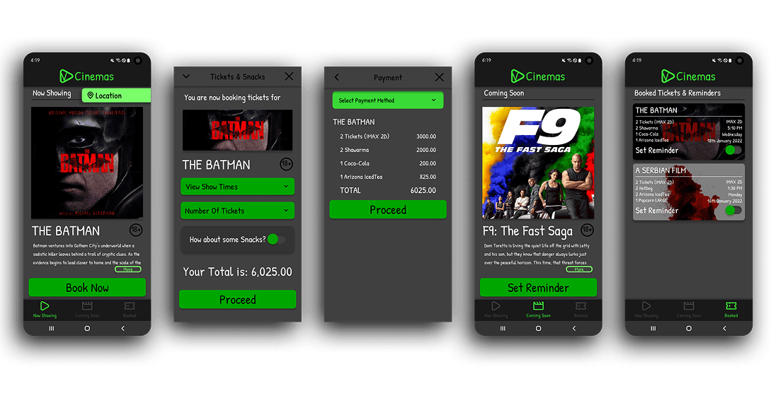
High fidelity Prototype
The interactive prototype simulated Full ticket booking flow, Snack selection logic & Ticket confirmation storage.
Prototype Validation Approach
- Remote moderated testing
- 5 participants
- Task-based scenarios
- Primary tasks include: Book 2 tickets, Add popcorn & Retrieve booked ticket
Study Results
- 4/5 completed without guidance
- Average booking time: ~2:45
- All users preferred mobile over in-person queue

Prototype Update Concept
- Added dedicated “Booked Tickets” page
- Introduced persistent Location FAB
- Improved snack quantity visual hierarchy
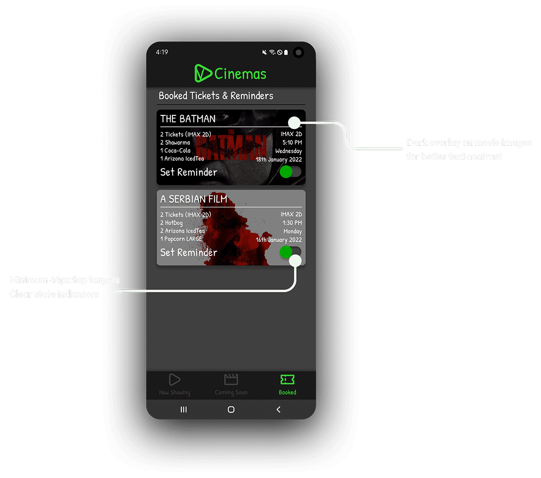
Accessibility Considerations
- High color contrast (dark mode optimized)
- Minimum 44px tap targets
- Clear state indicators
- Reduced motion compatibility
FINAL THOUGHTS / TAKEAWAYS
Final Results & Expected Outcomes
Vee Cinemas transforms pre-movie friction into a smooth digital flow. The app’s experience does the following:
- Reduces queue dependency
- Encourages snack pre-orders
- Provides confidence through clarity
Key Learnings (Design + Product + Process)
- Familiar interaction patterns reduce onboarding friction.
- Contextual clarity (location visibility) is critical in transactional apps.
- Removing friction increases adoption more than adding features.
- Even informal interviews can surface powerful insights when structured correctly.

Future Improvements / Next Steps
1
Real-time seat booking and hold timers
2
Snack combo recommendations
3
Loyalty integration upon purchases.
4
Push notifications for show reminders
Closing Summary
Vee Cinemas was designed to eliminate a small but meaningful frustration in the movie-going journey. By combining simplified flows, playful visual design, and user-validated improvements, the app reimagines how cinema-goers in Nigeria book tickets, transforming waiting time into anticipation.
