UX Case Studies - Dr. Notii
A Tool That Reminds You To Take Your Medication.
Dr. Notii is a cross-platform medication reminder and simple medication management app. It helps users add prescribed medications with dosage instructions, schedule periodic reminders, and manage inventory (low-stock alerts). The design emphasizes clarity for users with varying health literacy, quick task completion for busy caregivers, and accessible interactions for older adults.

 Figma
Figma Photoshop
 Illustrator
View interactive Prototype
[Mobile App]

View interactive Prototype
[Desktop App]
View interactive Prototype
[Mobile Website]
Why I Designed This
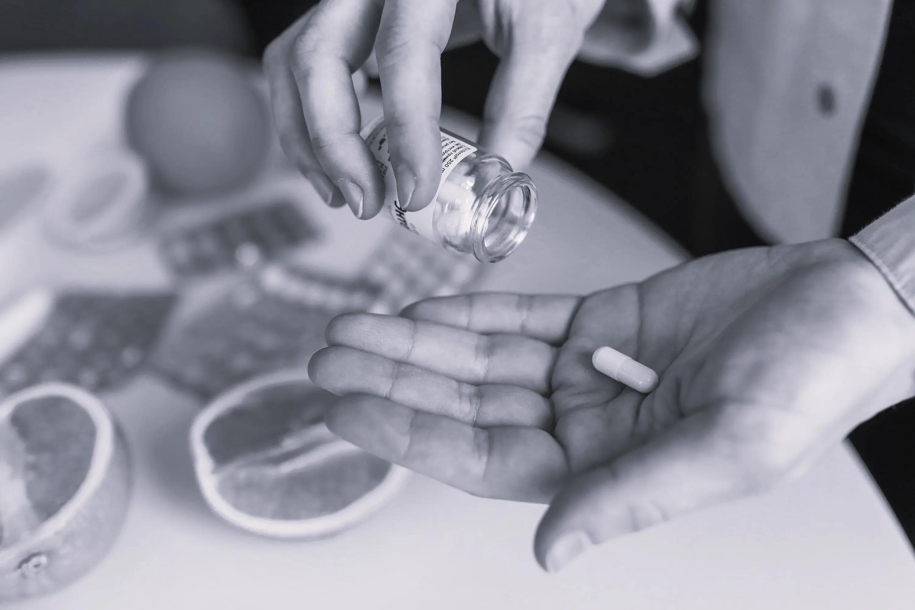
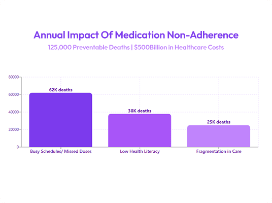
I designed Dr. Notii after researching the significant impact medication non-adherence has on health outcomes and realizing how many missed doses stem from simple friction; busy schedules, unclear instructions, and fragmented care. I wanted to create a calm, accessible tool that makes taking medication on time feel effortless, especially for patients and caregivers managing complex routines.

THE USER’S PERSPECTIVE
Market Research
Medication non-adherence is a major public health problem; WHO literature underscores the outsized population health impact of improved adherence. Many patients on chronic or complex regimens miss doses due to busy schedules, low health literacy, or fragmentation in care. Existing digital tools vary widely in usability, some are feature rich but complex; others are simple but lack features caregivers need (inventory alerts, clear pill identification).
Competitive Analysis
Before defining the product direction, I reviewed existing medication and health-tracking apps to understand how they handled reminders, setup flows, and caregiver use cases. The goal was to identify usability gaps, reduce friction, and uncover opportunities to create a simpler, more accessible experience.
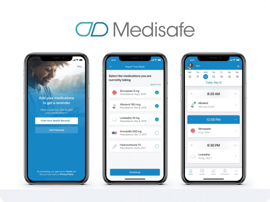
MediSafe (Direct)
Pros: Comprehensive feature set (scheduling, drug database, refill reminders).
Cons: Navigation is dense; menus and nested actions increase cognitive load for older users; visual hierarchy feels dated; onboarding asks too many questions up front.
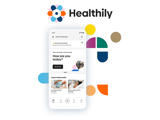
Healtily (Indirect)
Pros: Clean visuals, modern UI.
Cons: Lacks caregiver-centred features and inventory reminders; misses domain-specific microcopy for adverse effects/notes.
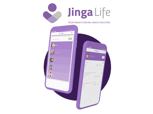
Jinga Life (Indirect)
Pros: Focus on habit formation and social sharing features for adherence.
Cons: Gamification-heavy approach may not work for elderly or privacy-sensitive medical users; lacks clear, quick-add workflows.
Opportunities identified from benchmarking
- Simplicity-first flows for adding medications
- Clear pill visuals to enable quick identification
- Inventory management + refill reminders that are explicit and easy to configure
- Caregiver features (assigning meds to patients, shared reminders)

User Survey
I ran short remote interviews over Whatsapp, targeting: adults on recurring medication, caregivers (family or professional), and older adults (55+).
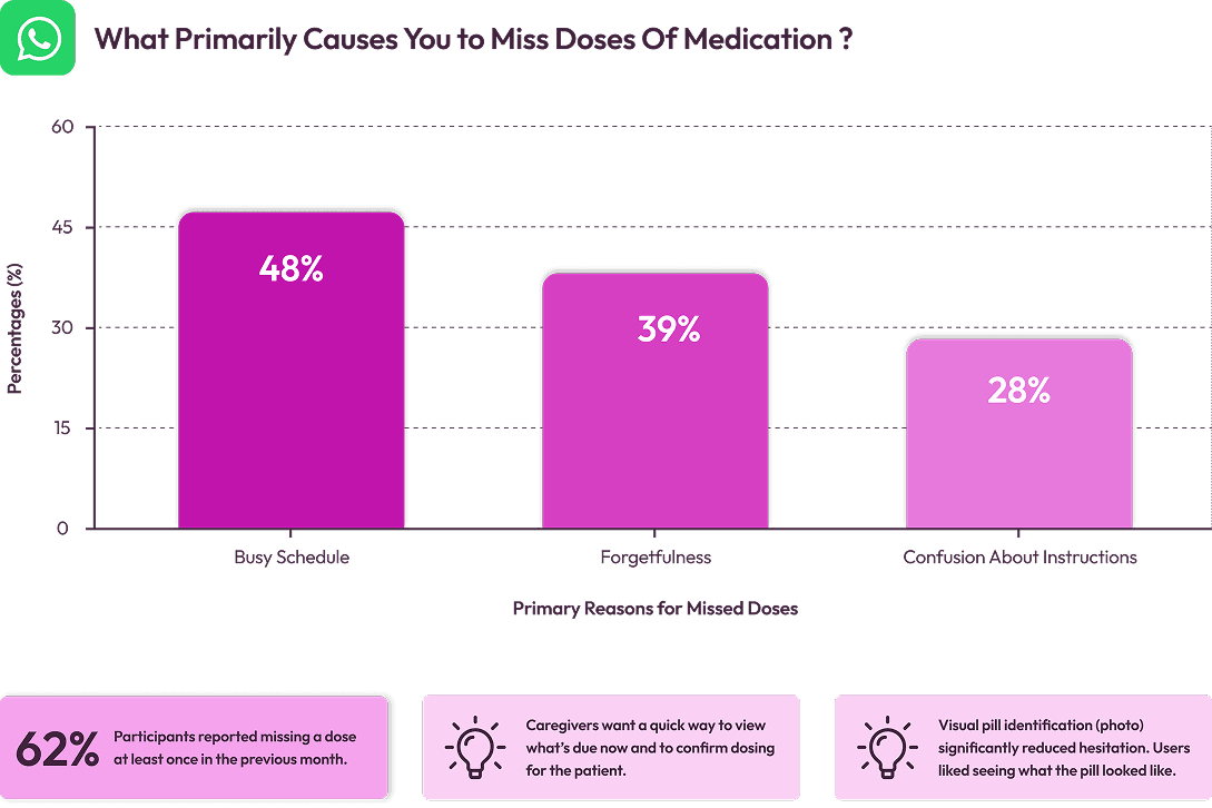
Assumptions validated
- Users value speed and reassurance (confirmation that dose taken)
- Low technical friction matters more than advanced reporting

Key Insights & Opportunity Areas
1
Users need a quick glanceable “what to take now” view: calendar + list hybrid reduces scanning time.
2
A progressive (multi-step) add form reduces perceived effort and increases completion vs one long form.
3
A small inventory reminder (low-stock notifications) is high utility for caregivers and older adults who rely on scheduled refills.
Opportunity
Design a multi-platform product combining a glanceable schedule, clear pill visuals, and a low-cognitive add flow, aimed to be reliable and calming rather than gamified.
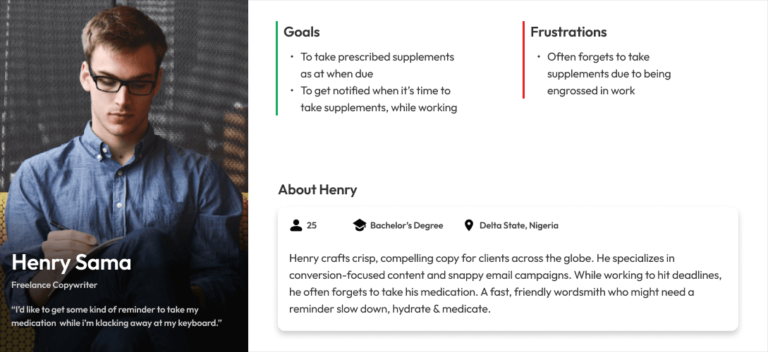
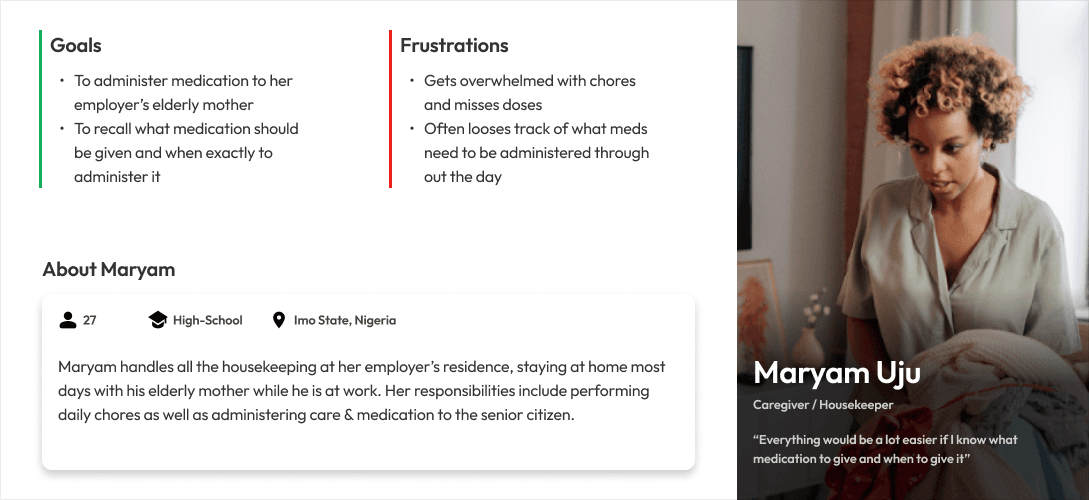
Personas
I created 2 personas to mirror two of our major classes of users: The “workaholic” individual & The Caregiver.
Research Summary
People on frequent or complex regimens and their caregivers struggle to reliably take/administer medication on time because existing tools are either too complex or lack caregiver-focused inventory and visual identification features.
UX Hypotheses
1
If we create a glanceable calendar + today view with pill thumbnails, users will identify the correct medication faster and mark doses taken more reliably.
2
If the add-med flow is broken into progressive steps with inline help and optional fields, completion rates will increase and time-to-add will decrease.
3
If we add inventory low-stock reminders, caregivers will avoid missed refills and interruptions in therapy.
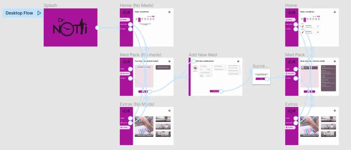
Frames & Wires
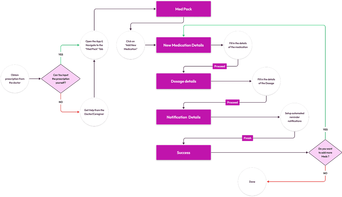
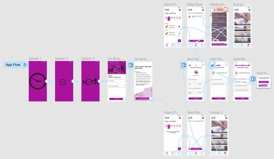
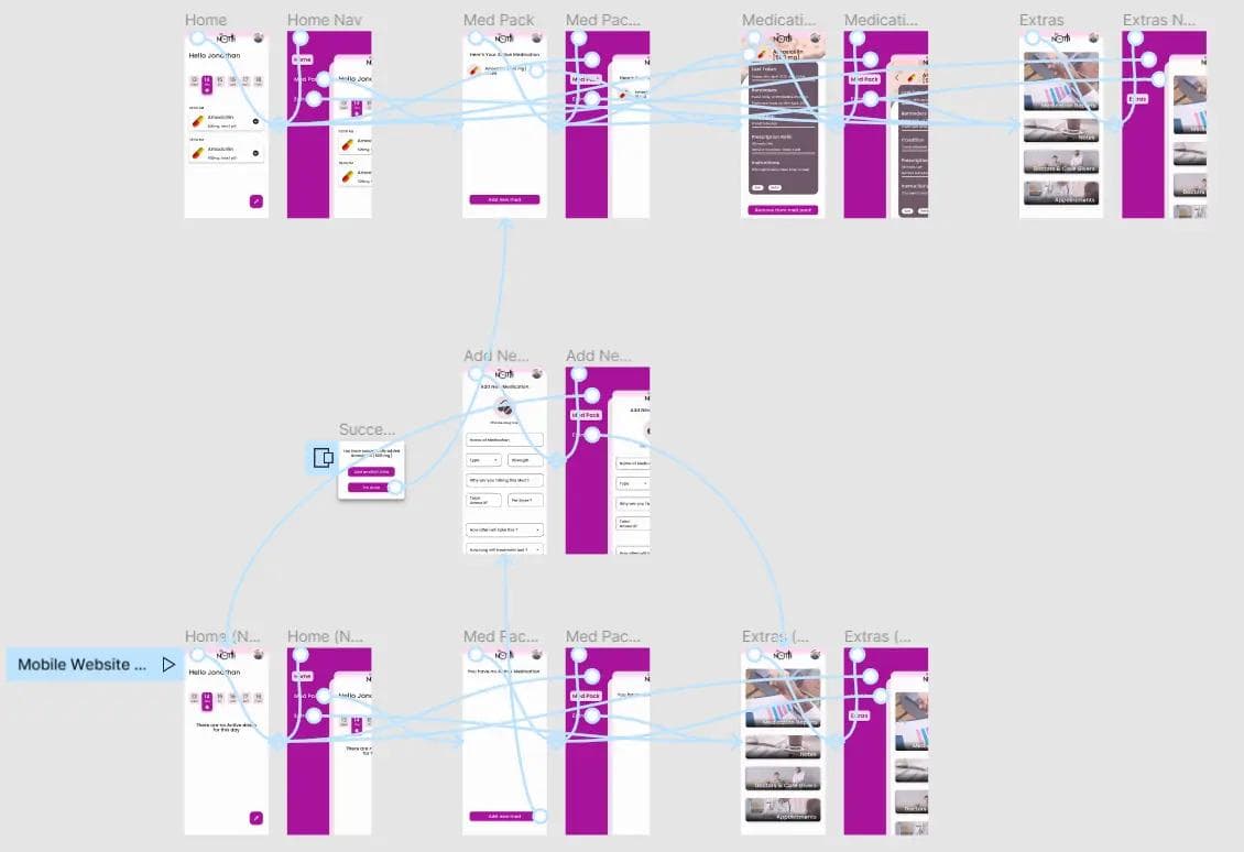
User Flow Diagram
I mapped the core user flows to clarify how patients and caregivers move through the product, from adding medication to logging doses and managing refills. This ensured each primary task could be completed with minimal steps and cognitive effort.
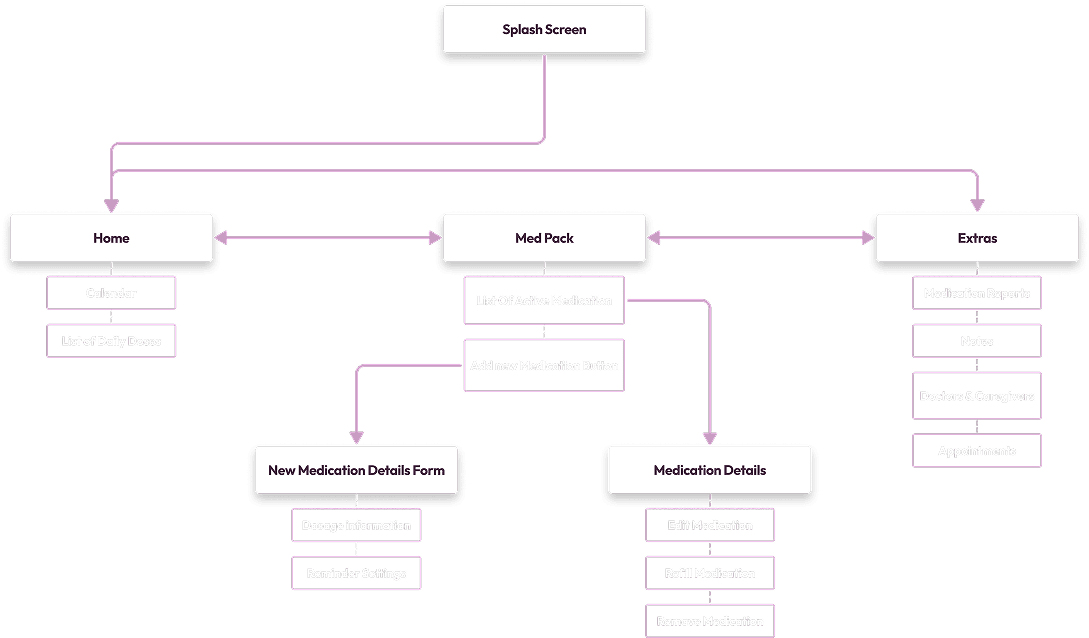
Information Architecture
The information architecture was structured around clarity and frequency of use, prioritizing “Today” and active medications while keeping secondary settings accessible but unobtrusive. The goal was to create a predictable, low-friction structure across mobile and desktop.
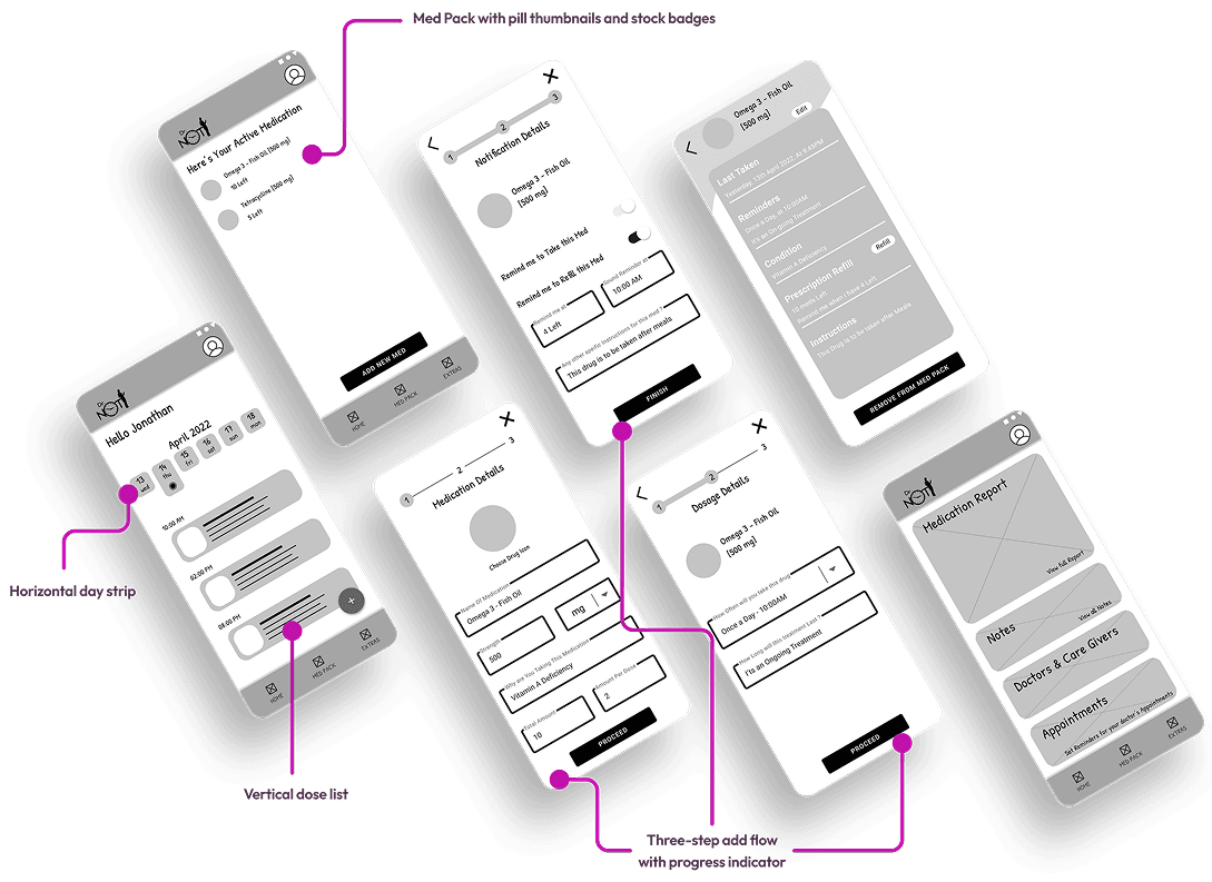
Low-Fidelity Wireframes
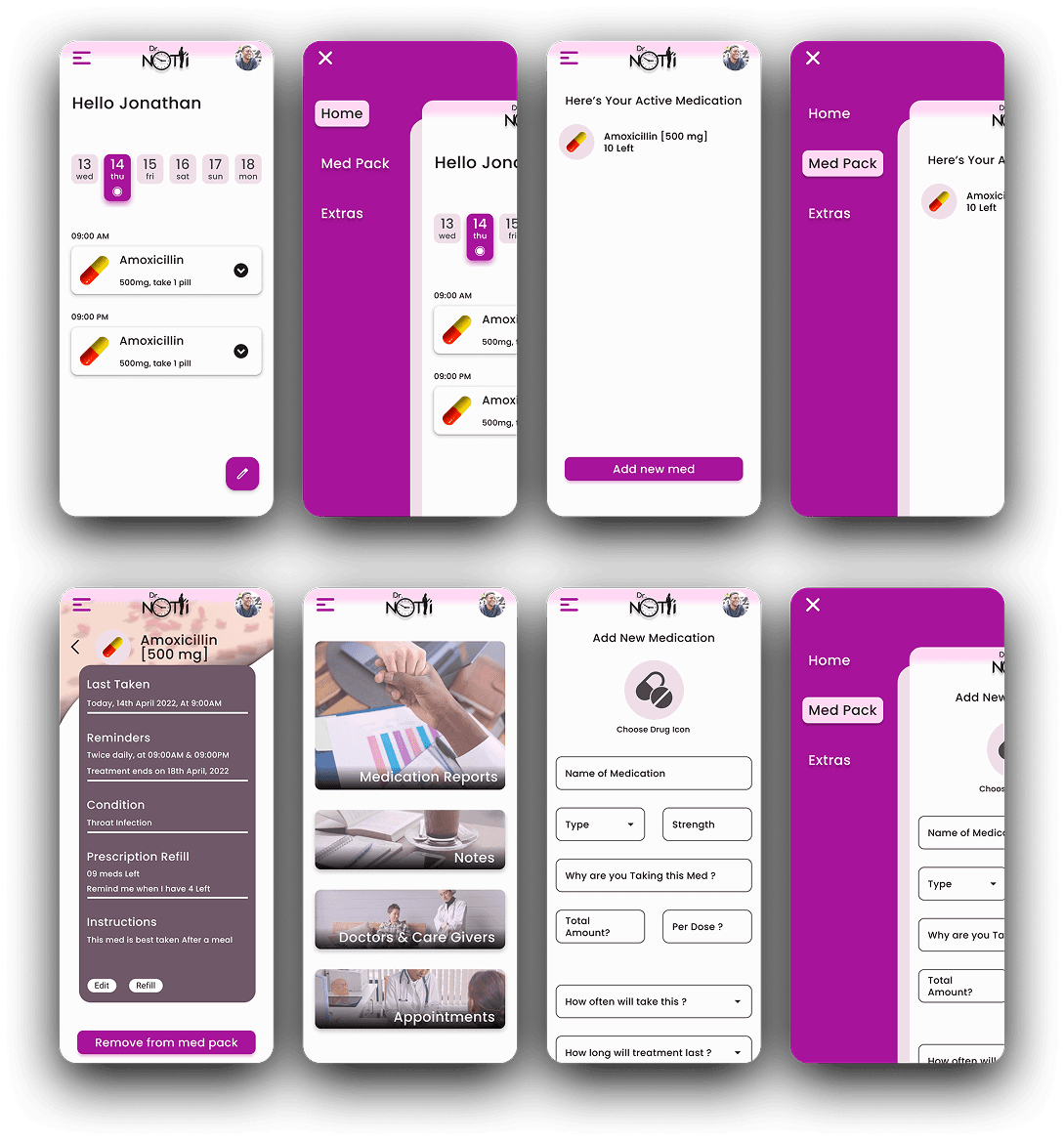
Low-fi wireframes were created for mobile and desktop showing: Today view with horizontal day strip and vertical dose list Med Pack with pill thumbnails and stock badges Three-step add flow with progress indicator
AESTHETICS & INTERACTIONS
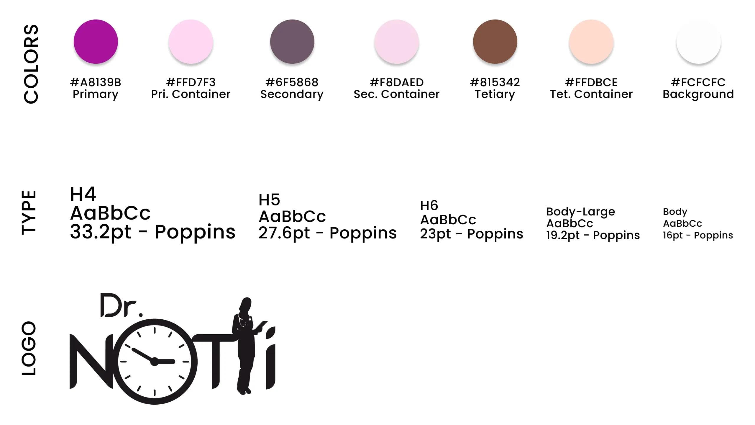
Style Guide
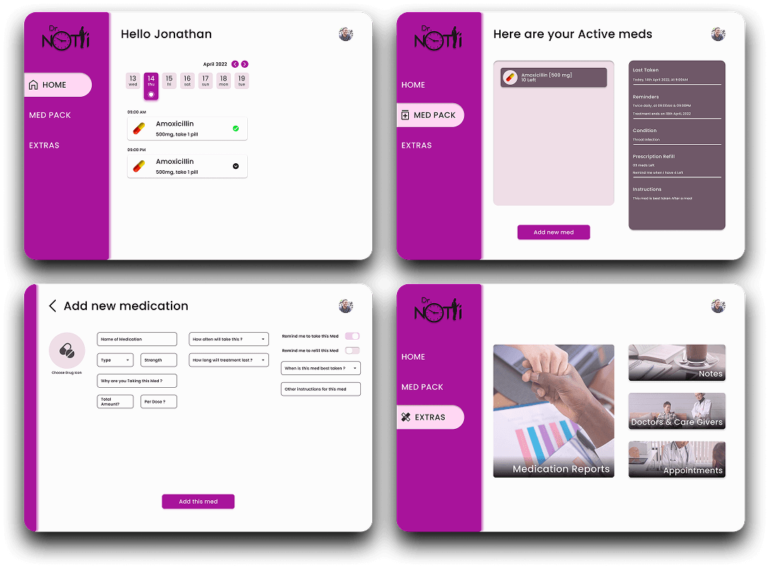
A compact, accessible design system was developed: brand tokens (colors, type), components (pill card, schedule row, progress button, input fields), and spacing rules. Components were built to be responsive across mobile and desktop.
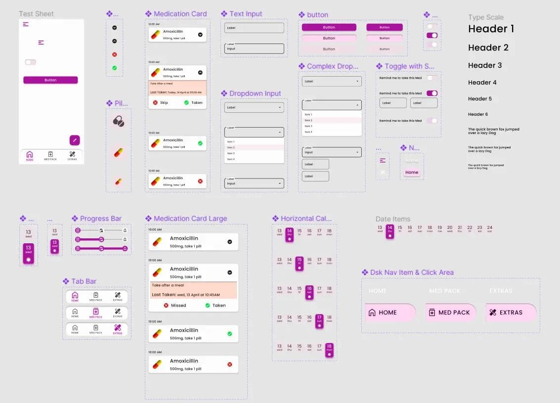
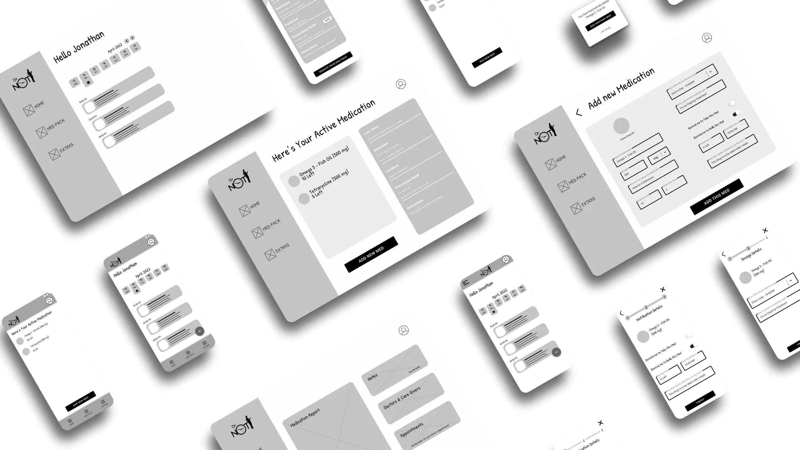
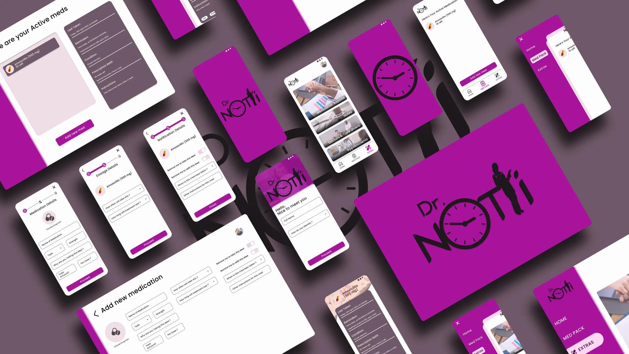
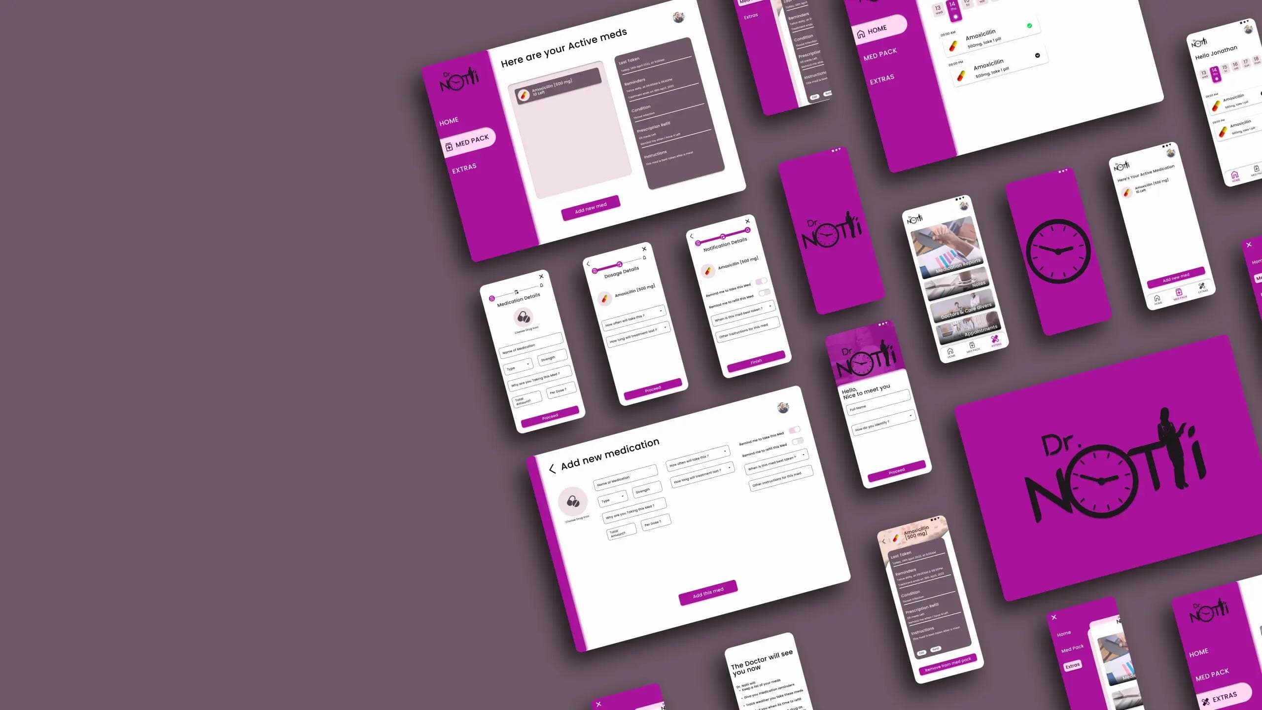
24 High fidelity designs were created across Mobile, Mobile Web & Desktop
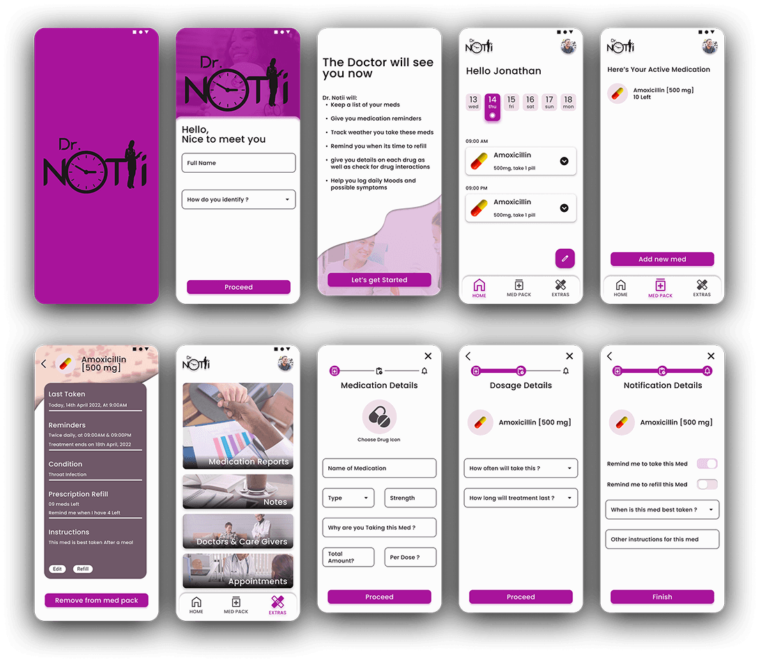
Key screens include:
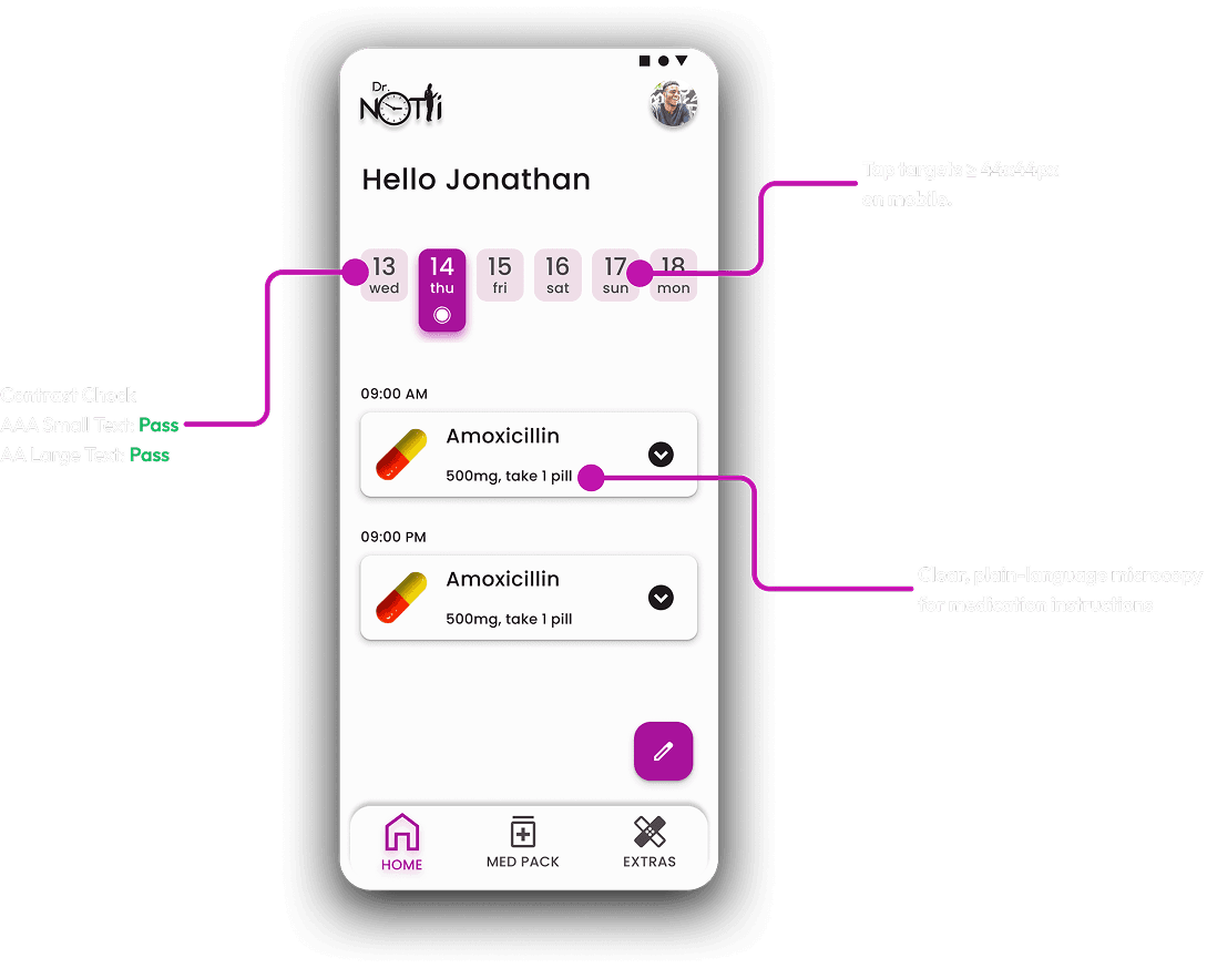
- Today / Home: Calendar stripe at top; next dose card prominent with large pill thumbnail, instructions, and actionable “Mark taken” button; history of taken doses below.
- Med Pack: List view with pill photos, remaining stock indicator, quick-edit (swipe on mobile), and reorder button.
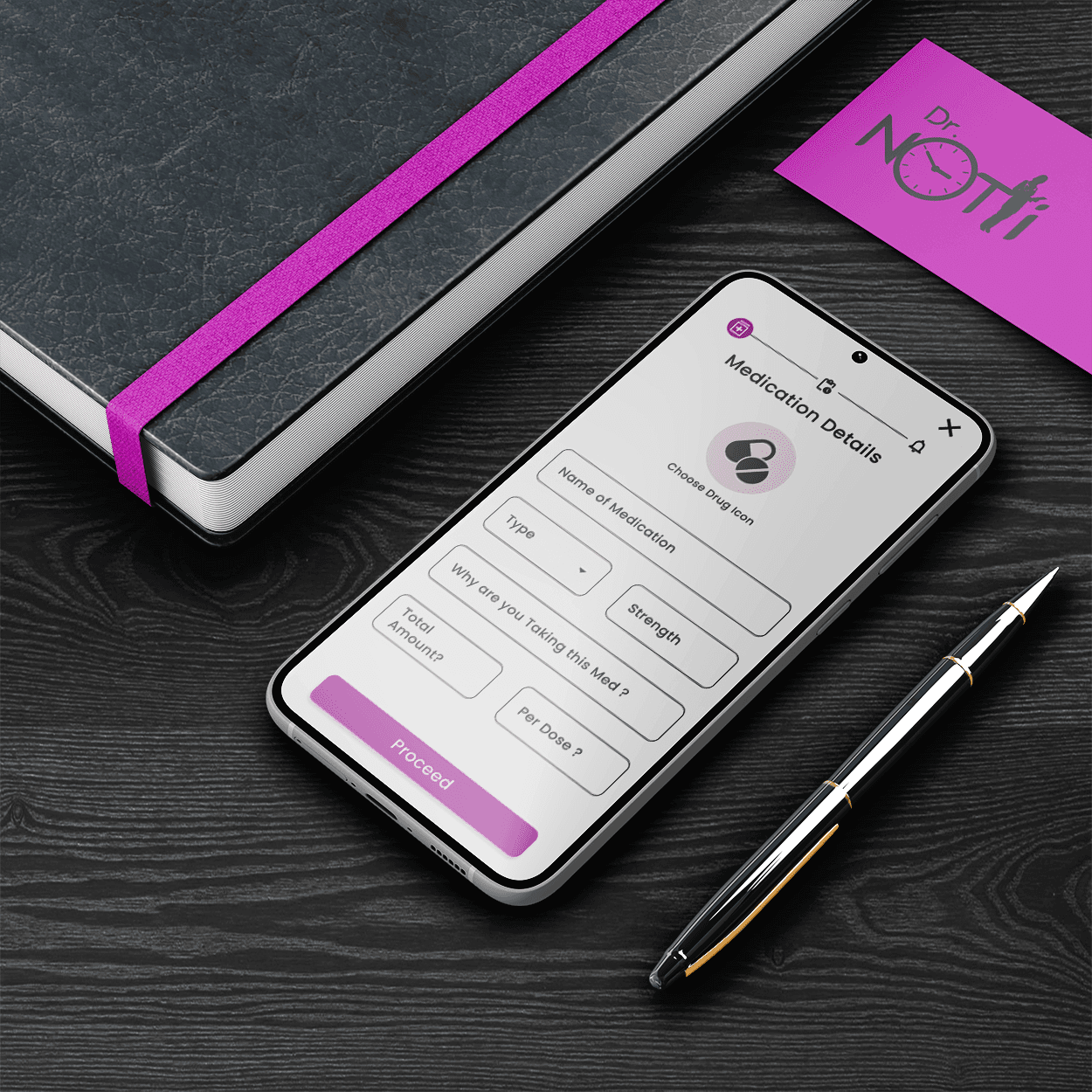
- Add Medication: 3 progressive screens with inline validation and an option to upload a pill photo or choose from sample photos.
- Patient / Caregiver view: Toggle between patients, shared schedule, and inventory levels.
High fidelity Prototypes
The clickable/interactive Figma prototype demonstrates: Adding a medication end-to-end & Daily taking flow.
- Motion is used sparingly to communicate state: subtle elevation and scale on press, slide transitions between add flow steps, and gentle micro-animations for confirmation (checkmark + pulse).
- Motion principles prioritize clarity and avoid disorienting transitions for older users. Animations are short (120–220ms) and reduce in intensity when accessibility “reduce motion” preference is enabled.
View interactive Prototype
[Mobile App]
View interactive Prototype
[Desktop App]
View interactive Prototype
[Mobile Website]
Prototype Validation Approach
- Moderated remote usability testing with 8 participants (mix of chronically medicated users, older adults, caregivers).
- Tasks: add a medication; set a low-stock threshold; mark a dose as taken.
- Metrics: task completion, time on task, errors, SUS score, qualitative feedback.
Study Results
- Task success (add medication): 7/8 completed without assistance (88%).
- Median time to add medication: 78 seconds (meets goal).
- SUS (System Usability Scale): 78 (good usability).
- Qualitative: Users appreciated pill thumbnails and short instructions. Older users wanted larger button sizes in some contexts.

Prototype Update Concept
- Larger Tap Targets: Increased the size and padding of primary actions and form inputs to improve touch accuracy for older users, aligning with Fitts’s Law and WCAG touch target guidance.
- Clearer Form Language: Simplified and clarified copy in the Add Medication form by replacing ambiguous wording with direct, plain-language labels and helper text, reducing cognitive load.
- Simplified Form Structure: Reduced on-screen inputs and improved spacing and hierarchy to make the form easier to scan and complete, supporting readability and accessibility best practices.
Accessibility Considerations
- Contrast ratios checked for WCAG AA for text and UI elements; key UI passed AA (some decorative elements adjusted).
- Tap targets ≥ 44x44px on mobile.
- Reduced motion preference respected (animations shortened or removed).
- Clear, plain-language microcopy for medication instructions; avoid jargon.
- Considered screen reader flows: dose cards have meaningful labels and states announced (“Metformin 500mg, due in 10 minutes”).
FINAL THOUGHTS / TAKEAWAYS
Final Results & Expected Outcomes
Dr. Notii arrived at a design that balances clarity, minimal friction, and caregiver needs. Based on prototype testing and benchmarked goals, the product is expected to:
- Increase medication logging compliance among pilot users
- Reduce missed doses through better visibility and low-stock alerts
- Provide caregivers with a reliable quick-check tool that fits into their workflow
Key Learnings (Design + Product + Process)
- Breaking complex forms into progressive steps significantly improves completion and perceived effort.
- Pill photos reduce hesitation and improve confidence when taking/administering meds.
- Caring for both the patient and caregiver contexts early prevents rework and feature bloat later.
- Making the product usable for older adults benefits all users (clear hierarchy, large targets, plain language).

Future Improvements / Next Steps
Pharmacy integration
Auto-refill / pharmacy ordering integration to close the loop on low-stock alerts.
Cross-device sync
Real-time sync for caregivers and shared patient accounts.
Medication database
Optional verified database for drug information and manufacturer images.
Clinician integration
Secure summary exports for clinicians to review adherence patterns.
Analytics & A/B testing
Test reminder phrasing, timing windows, and visual prominence to optimize adherence rates.
Closing Summary
Dr. Notii is designed to be a humane, no-nonsense medication assistant: fast to set up, clear to use, and built around the real needs of patients and caregivers. By combining a glanceable calendar, pill imagery, progressive add flows, and caregiver-centric inventory features, the product addresses adherence gaps with pragmatic UX choices—reducing friction where it matters and focusing future work on closing the integration gaps that will make the service indispensable.
