UX Case Studies - Cashare
Making Shared Expenses Transparent, Secure, and Stress-Free for Nigerians
Cashare is a mobile app that simplifies how Nigerians split, track, and settle shared expenses. It enables organizers to create shared bills, assign equal or custom splits, monitor payment progress in real time, and disburse funds through secure local gateways like Paystack and Flutterwave. The product bridges social finance and fintech infrastructure, combining group expense logic with localized payments and an in-app wallet to reduce friction, confusion, and social tension.

 Figma
Figma Photoshop
Why I Designed This
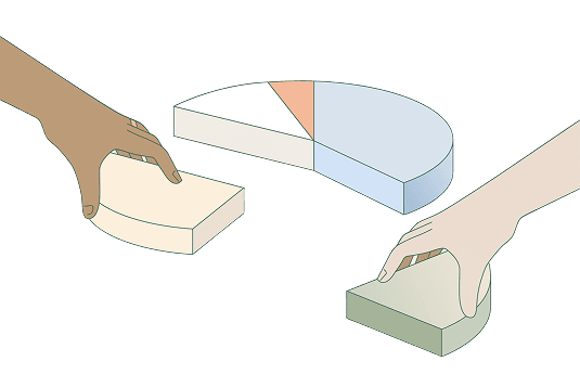
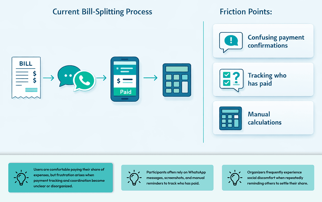
In Nigeria, group expenses are common from restaurant outings to Airbnb bookings and shared utility bills. However, coordination is largely manual and socially uncomfortable. People rely on, WhatsApp group chats, Bank transfer screenshots, Manual calculations, Repeated reminders. I saw an opportunity to introduce structure, automation, and transparency into this everyday friction point, without overcomplicating the experience.

Exploring Real-World Bill Splitting

Market Research
Nigeria has high peer-to-peer transaction activity driven by Informal group savings, Shared housing, Social events & Cooperative financial behaviors. However, there is no product tailored specifically for group expense management with localized payment rails + real-time tracking + structured reminders. The opportunity was not inventing expense splitting, it was localizing and operationalizing it for Nigerian financial behavior.
Competitive Analysis
To understand how expense-sharing products currently solve (or fail to solve) this problem, I conducted a competitive review of both direct competitors and adjacent fintech products. The goal was to identify patterns in how shared financial interactions are handled, understand common UX conventions in financial apps, and uncover opportunities to localize the experience for Nigerian users.
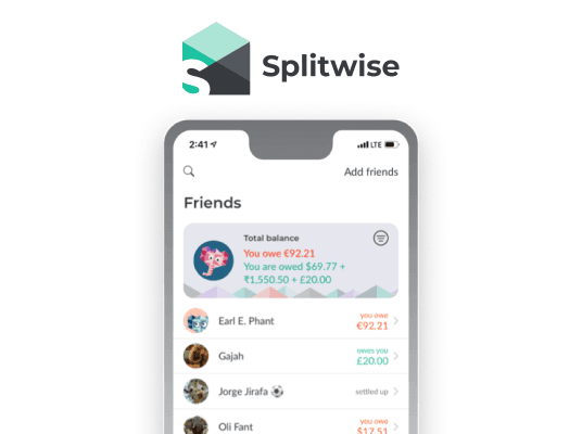
Splitwise (Direct)
Pros: Mature group-expense logic that simplifies calculating shared payments across multiple participants.
Cons: Lacks localized Nigerian payment integrations, making the settlement process dependent on external transfers.
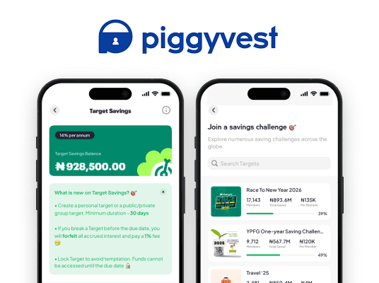
PiggyVest - Target Savings (Direct)
Pros: Strong local payment infrastructure and high trust among Nigerian users.
Cons: Built for collaborative savings rather than real-time shared expense settlement.
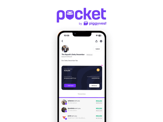
PocketApp - Group Pocket (Direct)
Pros: Encourages social financial collaboration with group-based money features.
Cons: Limited expense splitting logic and no reminder system for pending contributions.
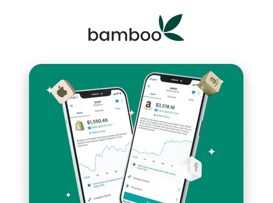
Bamboo (Indirect)
Pros: Clean, intuitive interface with strong fintech trust signals and minimal cognitive load.
Cons: Focused on investment workflows rather than collaborative financial management.
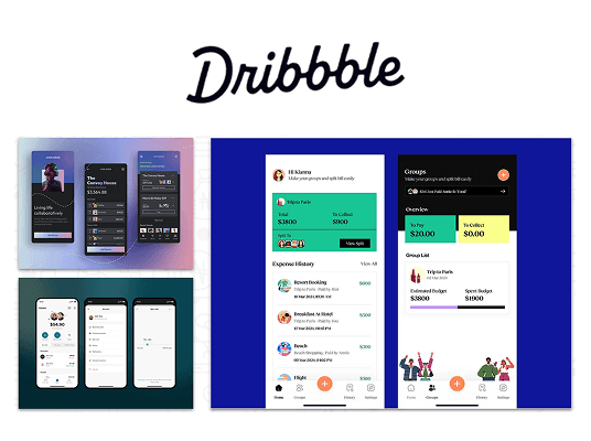
Dribbble Concept References (Indirect)
Pros: Provides inspiration for modern UI patterns, microinteractions, and visual hierarchy.
Cons: Many concepts prioritize aesthetics over real-world usability or localized financial flows.
Opportunities identified from benchmarking
- Introduce localized payment integration tailored to Nigerian banking behaviors.
- Provide clear payment status visibility for each participant.
- Enable automated expense splitting with flexible configurations.
- Design socially neutral reminder mechanisms that remove awkward follow-ups.
- Introduce a centralized wallet payout system to simplify fund collection and disbursement.
- Combine social finance patterns with fintech-grade trust signals.

User Survey
To validate assumptions around group expense behavior, I conducted a lightweight user discovery exercise with young professionals who frequently split bills with friends, colleagues, or housemates. The objective was to understand how people currently coordinate payments and where the most friction occurs in the process.
Assumptions validated
- Users want automated split calculations
- Visibility reduces trust issues
- Payment confirmation must be instant
- Reminders should feel neutral and system-generated

Key Insights & Opportunity Areas
1
When participants can clearly see payment progress, trust increases and fewer reminders are needed.
2
The person who creates the expense typically handles tracking, reminders, and reconciliation.
3
Users want clear proof that their payment was received and registered.
Opportunity
Design a localized expense-sharing platform that combines transparent tracking, automated calculations, and integrated payments, reducing both administrative effort and social tension in group financial interactions.
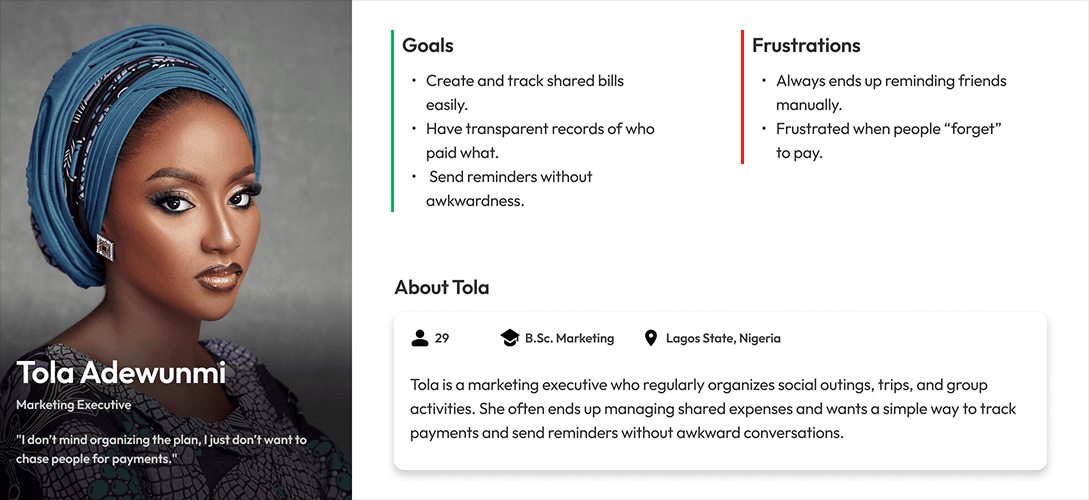
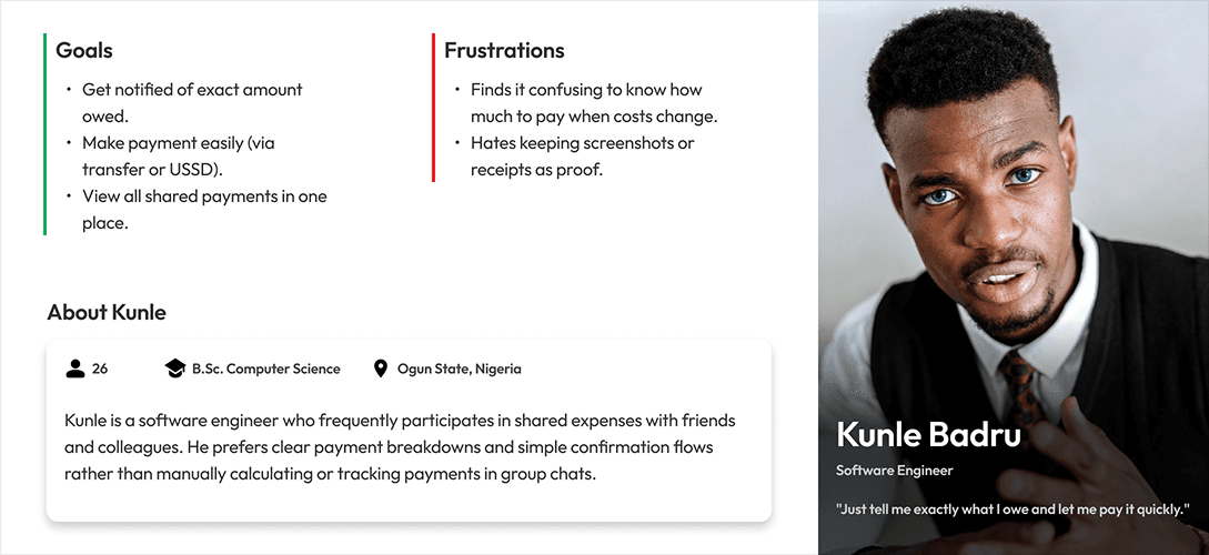
Personas
To ground the design in real-world behaviors, I synthesized insights from research into two primary user archetypes: the Organizer and the Participant. While both roles interact with the same system, their motivations and responsibilities differ significantly. Organizers prioritize coordination and visibility, while participants focus on quick payment and clear confirmation. These personas helped guide design decisions around workflow structure, interface clarity, and notification design, ensuring each user type could accomplish their tasks with minimal friction.
Research Summary
Nigerians who frequently share expenses need a transparent and localized way to track and settle group payments without social tension or manual coordination. The opportunity therefore lies in designing a structured yet lightweight system that simplifies expense creation, tracks payment progress transparently, and enables seamless settlement through familiar local payment methods.
UX Hypotheses
1
If payment status is visually transparent, users will trust the system and reduce manual verification.
2
If organizers can automate split calculations and reminders, the coordination burden will decrease significantly.
3
If participants can settle payments through localized gateways inside the flow, payment completion rates will increase.
Sketching the Cashare Experience
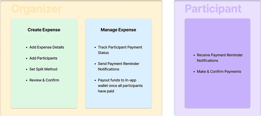
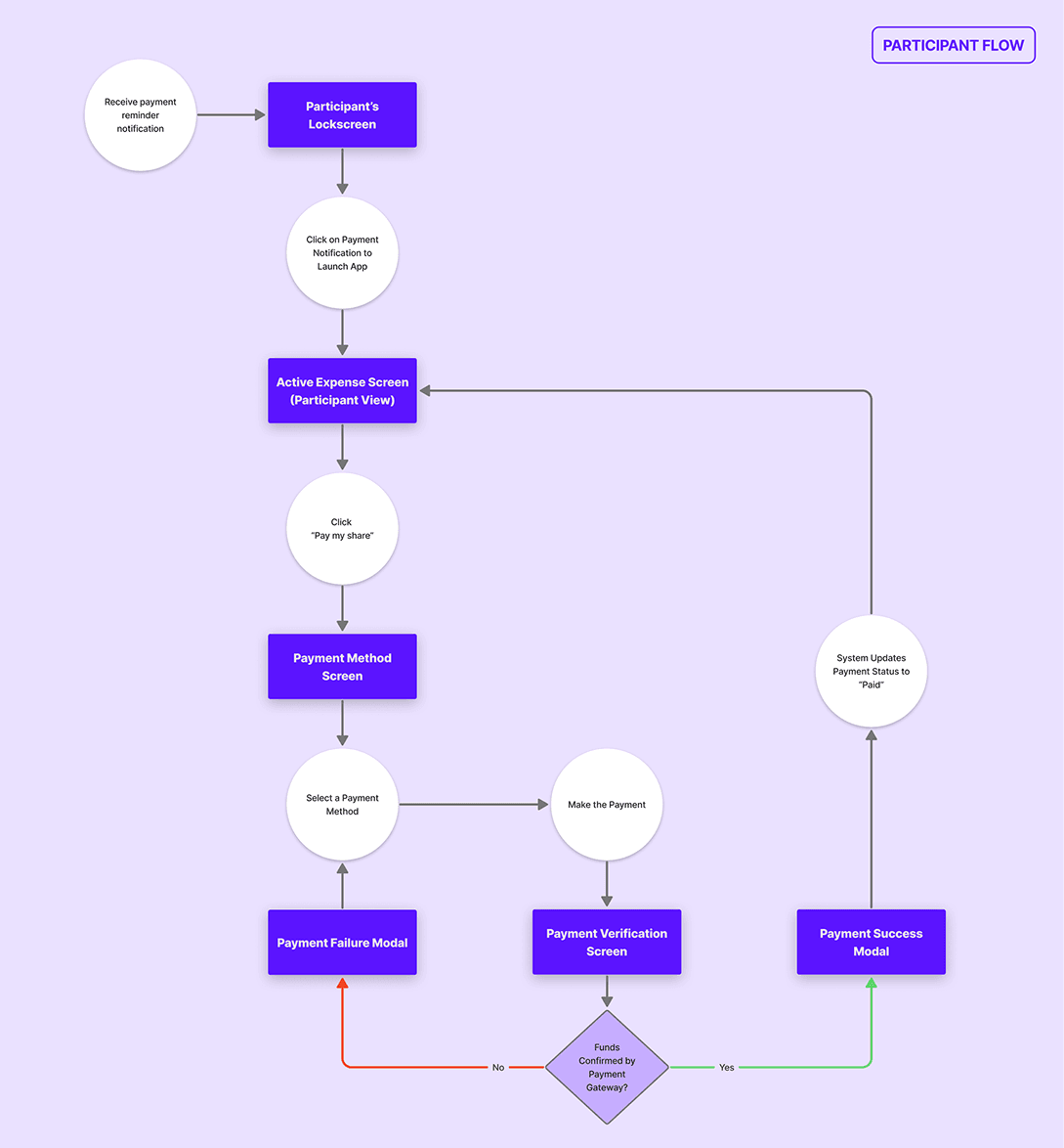
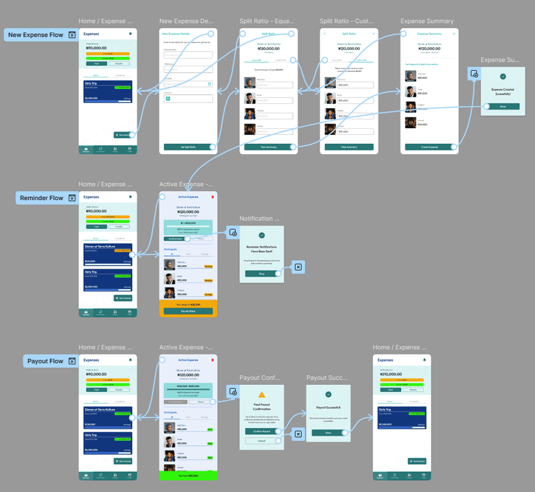
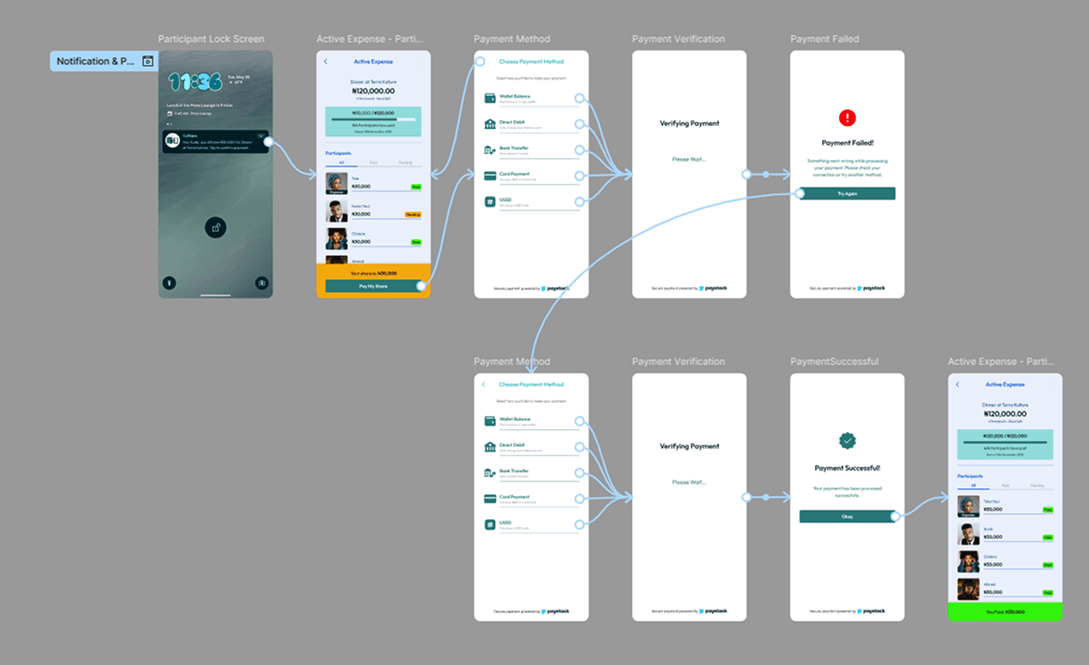
User Flow Diagram
To ensure the product supported real user behavior, I mapped the core journeys for the two primary roles in the system: the Organizer and the Participant. These flows outline how expenses are created, shared, paid, and completed, helping identify the most efficient paths while reducing unnecessary steps and cognitive load throughout the experience.
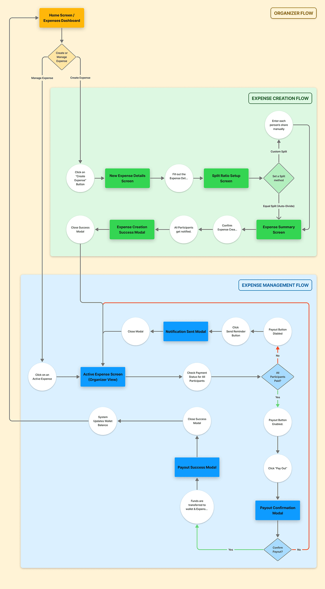
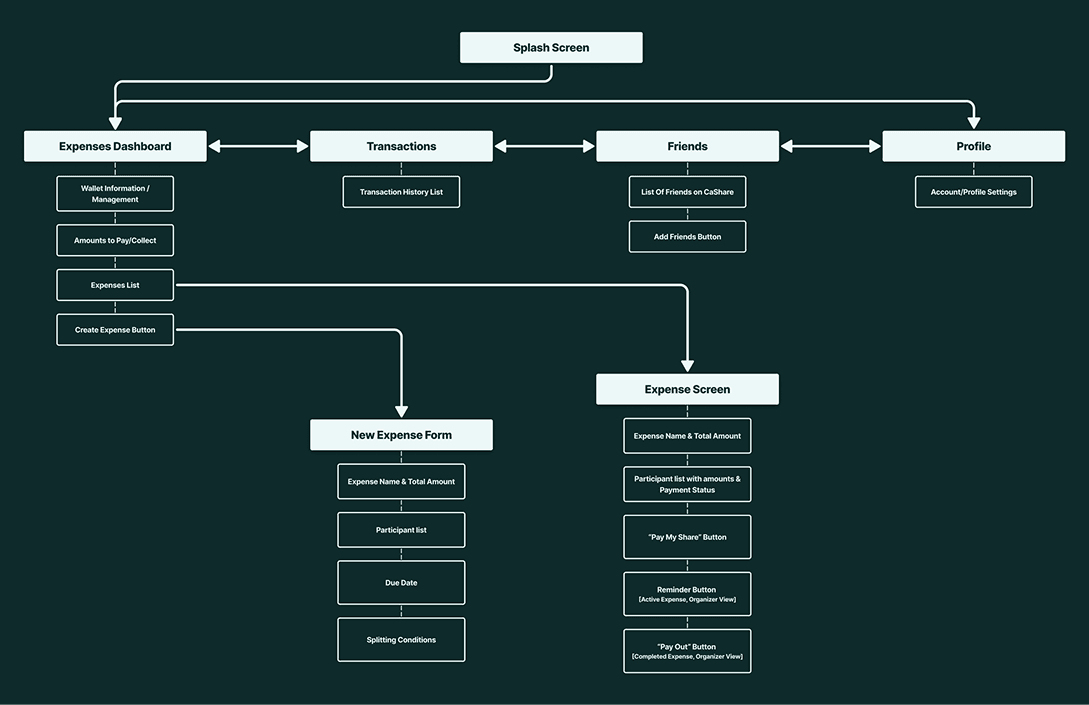
Information Architecture
The information architecture was designed to prioritize clarity and quick decision-making. Core actions such as viewing active expenses, creating new splits, tracking payment progress, and completing payouts were structured around a simple hierarchy, ensuring users could easily understand the state of each expense and take the next appropriate action without confusion.
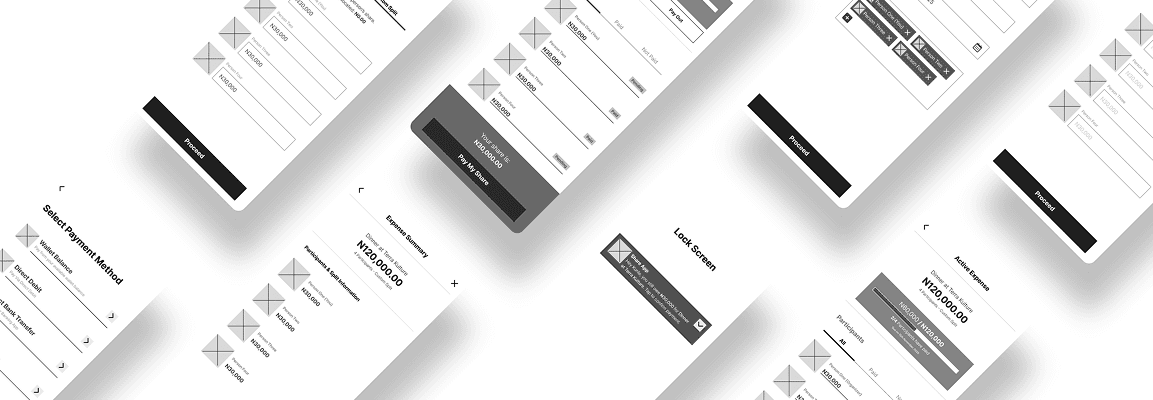
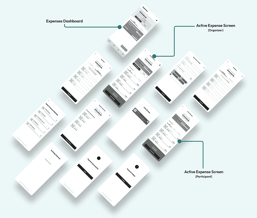
Low-Fidelity Wireframes
Low-fidelity wireframes were used to explore layout structure, interaction patterns, and task flows before introducing visual styling. At this stage, the focus was on simplifying the organizer and participant journeys, validating screen hierarchy, and ensuring the core interactions [creating expenses, tracking payments, and confirming transactions] remained intuitive and efficient.
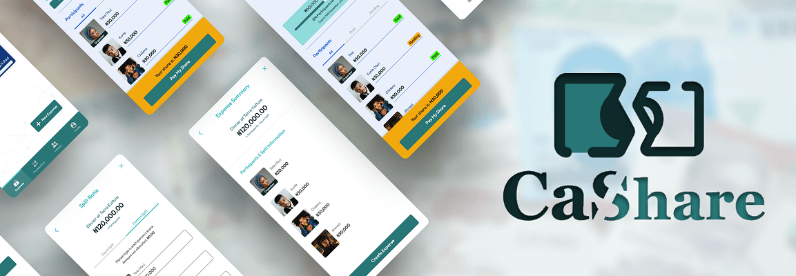
The Cashare Interface
Style Guide
The visual style was intentionally kept clean, modern, and accessible to reflect the trust and clarity expected from a financial product. The design system combines a bold blue and confident green color palette with a minimal typographic hierarchy, creating a consistent interface that supports usability while reinforcing a secure and professional product identity.
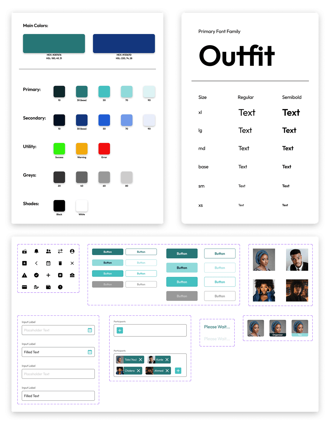
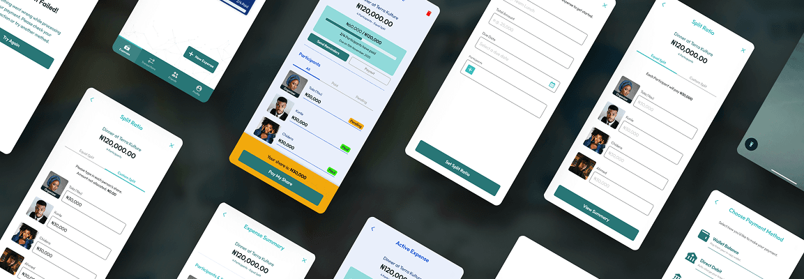
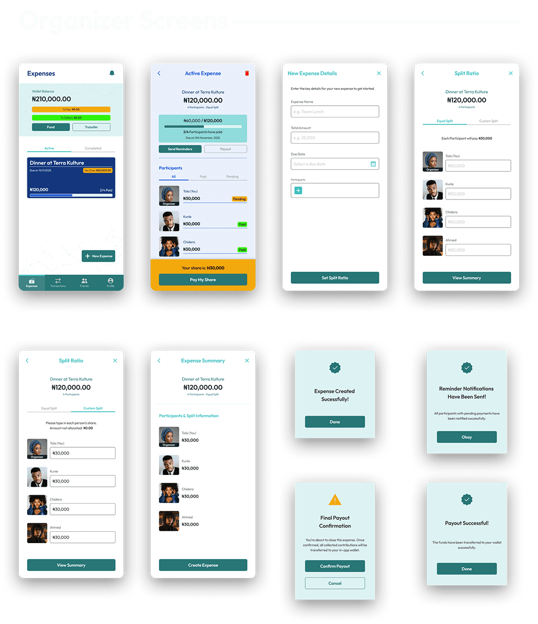
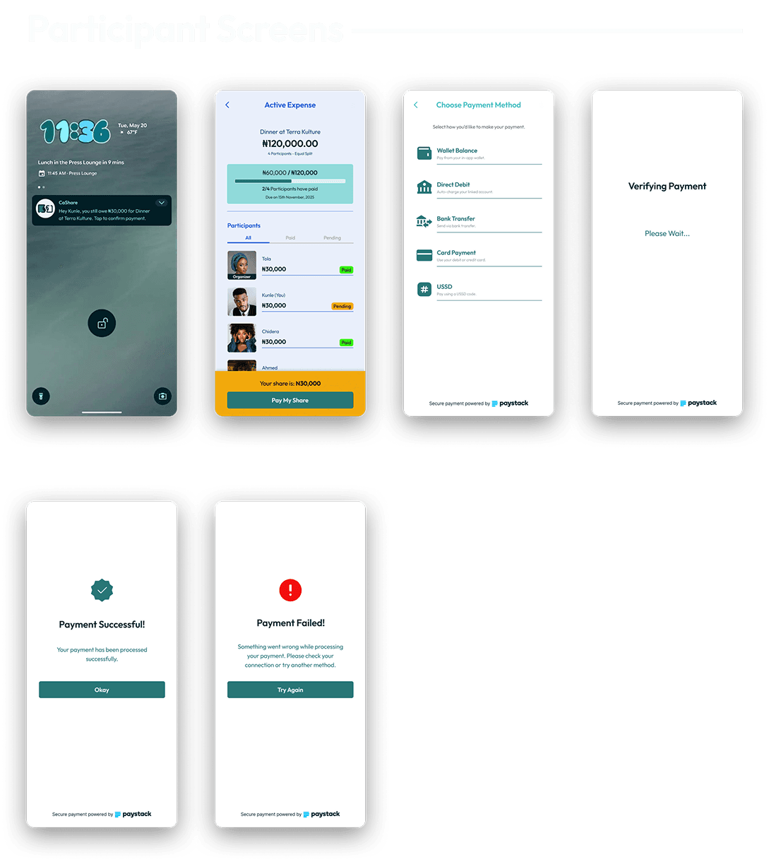
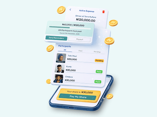
23 High fidelity mobile app designs were created
The high-fidelity designs translate the validated wireframes into a polished mobile interface that reflects fintech trust, clarity, and usability. The visual system focuses on strong hierarchy, clear payment states, and simple interaction patterns that make expense tracking and settlement easy to understand at a glance. Key priorities in the final UI included:
- Clear visibility of payment progress and participant status
- Simple expense creation and split configuration
- Familiar fintech interaction patterns to build user confidence
High fidelity Prototypes
Interactive prototypes were created to simulate the end-to-end experience for both primary user roles: the Organizer and the Participant. These flows demonstrate how users create expenses, receive payment requests, complete transactions, and track settlement progress within a seamless mobile experience. The prototypes highlight: Organizer flows for creating and managing shared expenses Participant flows for viewing, confirming, and completing payments Key interaction states including payment verification and success/failure feedback
Prototype Validation Approach
- A small usability walkthrough was conducted remotely
- Task-based testing was utilized with 6 participants
- Tasks included: Create expense, Modify split, Complete payment
Study Results
- 5/6 completed tasks without guidance
- 1 user struggled with custom split logic
- 2 users expected automatic reminders

Prototype Update Concept
- Added inline split calculator preview
- Added explanatory wallet tooltip
- Increased reminder button prominence
- Improved payment confirmation animation
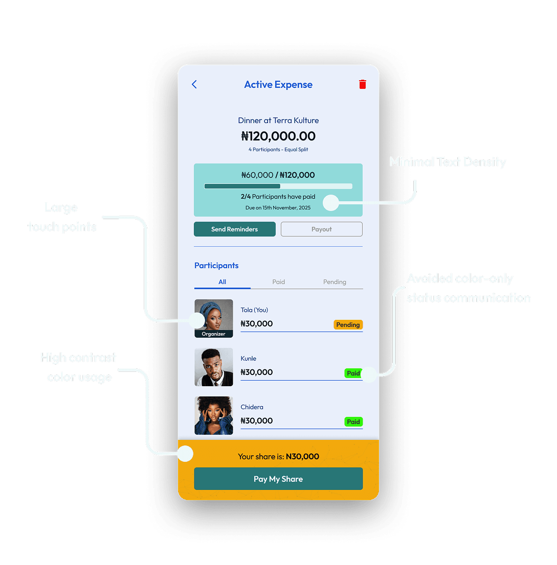
Accessibility Considerations
- High contrast color usage
- Clear error messaging
- Large touch targets
- Minimal text density
- Avoided color-only status communication
Design Outcomes & Key Takeaways
Final Results & Expected Outcomes
The final design delivers a streamlined experience that reduces friction in group expense coordination while introducing transparency and trust into the payment process. By combining clear payment tracking with localized payment options, Cashare enables both organizers and participants to manage shared expenses with minimal effort. Expected product impact includes:
- Reduced confusion around payment tracking
- Faster settlement of shared expenses
- Less manual coordination for organizers
- Greater confidence in payment confirmation and transaction status
Key Learnings (Design + Product + Process)
- Simplicity in fintech builds trust faster than visual complexity.
- Social finance products must reduce emotional friction, not just functional friction.
- Even within a 1-week sprint, structured thinking enables depth.

Future Improvements / Next Steps
1
Automated scheduled reminders
2
Expense deletion flow with refund logic
3
Push notification intelligence
4
Recurring group expense templates
5
AI-powered smart split suggestions
Closing Summary
Cashare reimagines how Nigerians split shared expenses by combining structured group logic, localized payments, and transparent tracking in one cohesive mobile experience. By grounding the product in behavioral insight, fintech trust principles, and clean visual systems, I transformed a common social friction point into a streamlined, scalable solution. This project demonstrates product thinking, UX clarity, and system-level design execution, built for real-world behavior, not just beautiful screens.
