Logos & Branding - Unity Cybercafe
A unified digital service hub built on trust, accessibility, and everyday convenience.
Unity CyberCafe is a neighborhood-focused digital service provider offering essential online and document-related services, ranging from internet access and photocopying to passport photography, NIN enrollment, and online application support. As a new SME entering a competitive and highly functional market, the brand needed an identity that immediately communicated professionalism, reliability, and cohesion, while remaining approachable to a broad audience including students, working professionals, travelers, and everyday users requiring official digital documentation support.

 Photoshop
 Illustrator
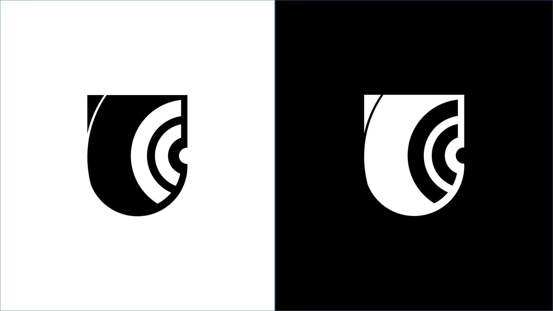
The Problem
- No existing visual identity to establish trust in a sensitive data-handling environment
- High competition with visually generic cybercafes lacking professional branding
- Need to appeal to a broad, non-niche audience with varying technical literacy
- Requirement to visually communicate both reliability and digital competence
Design Objectives
- Create a strong, professional first impression that builds immediate trust
- Visually express unity, connectivity, and security through strategic symbolism
- Ensure scalability across signage, print, and digital formats
- Develop a brand system that feels credible yet approachable

Approach
Discovery & Strategic Foundation
A review of local cybercafes revealed a pattern of cluttered logos, overused tech icons, and inconsistent typography. Most competitors lacked clear symbolism, consistent color systems, and distinctive brand marks. This created an opportunity to stand out through structure, restraint, and meaningful symbolism rather than visual noise.
Market Analysis
Competitive audit revealed dated imagery, cluttered designs, and lack of strategic refinement across local cybercafes.
Positioning
Positioned as a reliable digital service partner emphasizing connection, protection, and togetherness over transactional browsing.
Concept Development
Early explorations focused on letter-based marks, connectivity symbols, and security-driven shapes using symbolic abstraction.
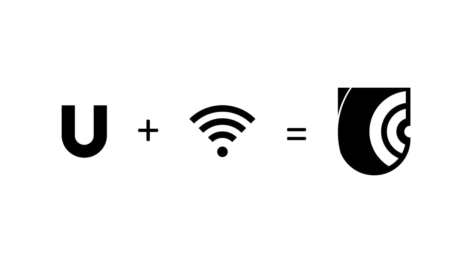
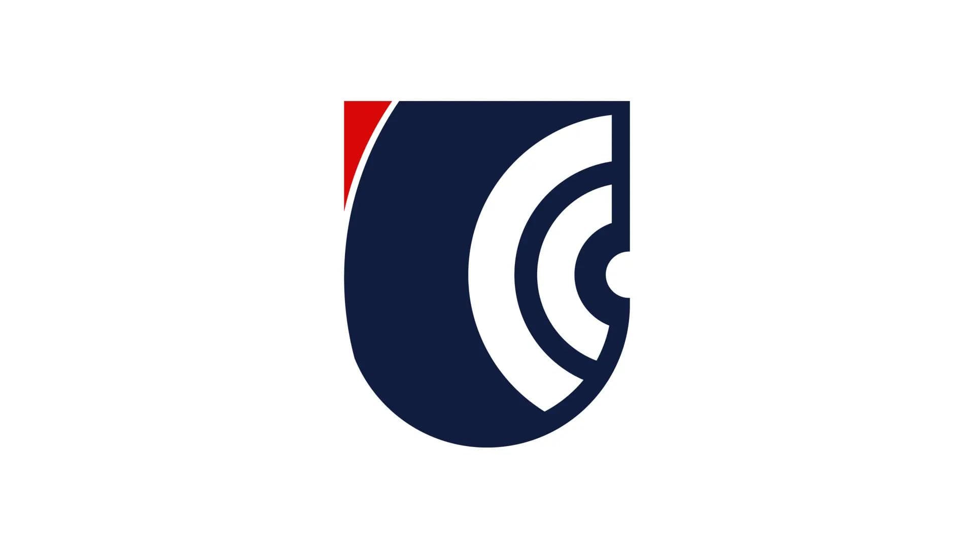
The Chosen Concept
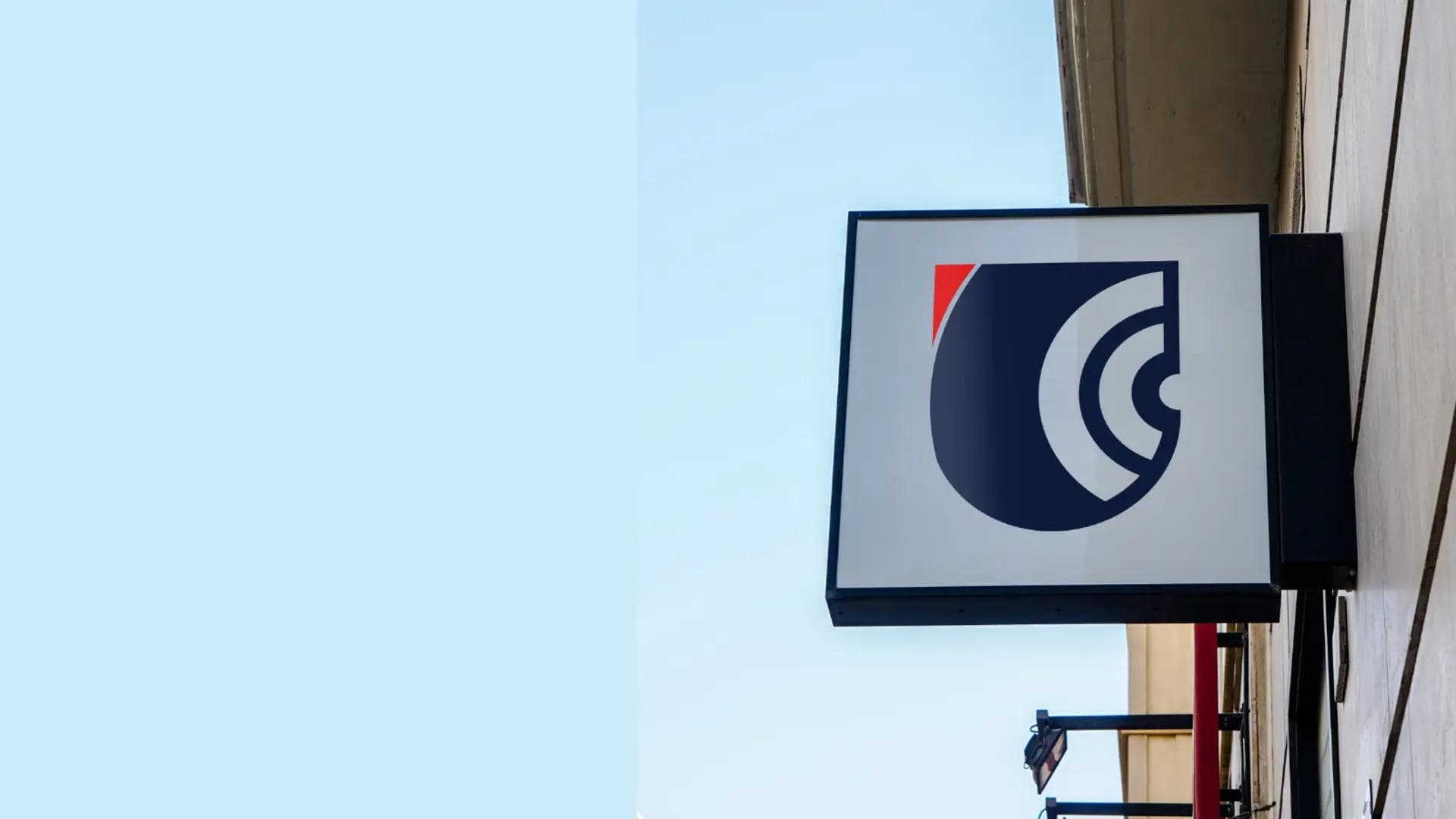
The final concept merges a blocked "U" shape with a Wi-Fi symbol cut out from its center, subtly framed as a shield. This communicates unity, connectivity, and protection in a single, memorable mark; aligning directly with the brand's service promise.
- U: Unity, togetherness
- Wi-Fi: Access, connectivity, digital service
- Shield: Trust, security, reliability
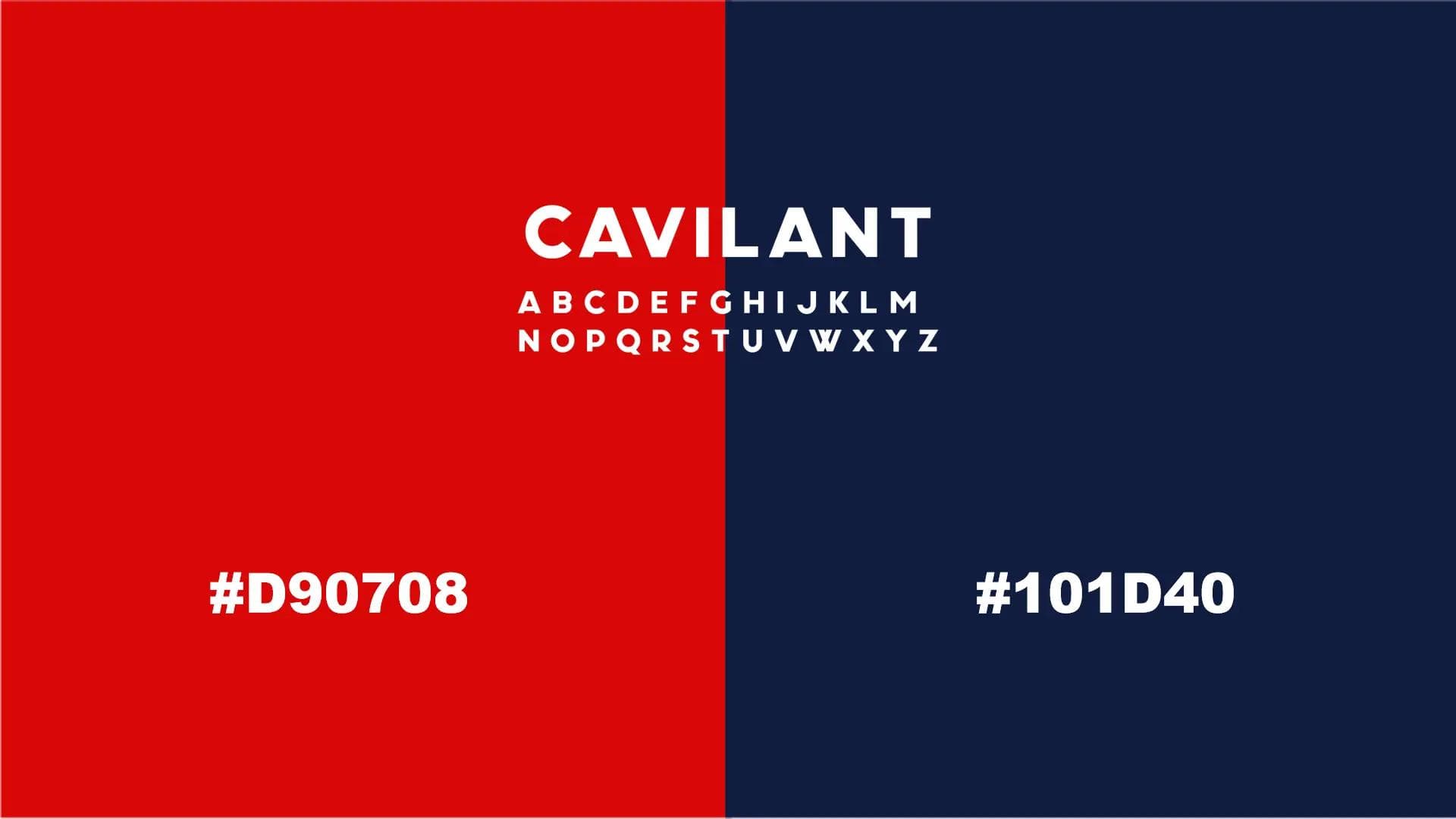
- Color - Navy Blue [#101D40]: Trust, stability
- Color - Red [#D90708]: Energy, urgency
- Font - Cavilant: Clean, modern structure reinforcing professionalism without feeling rigid or corporate
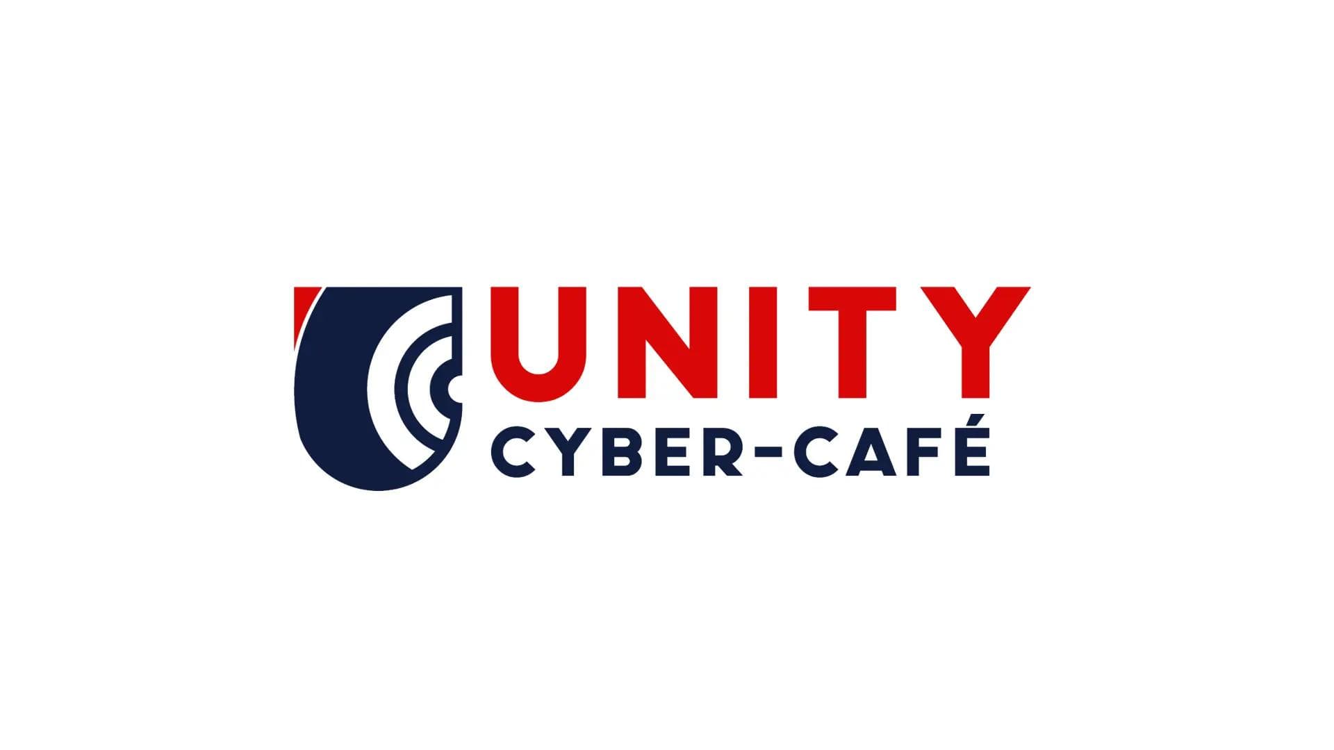
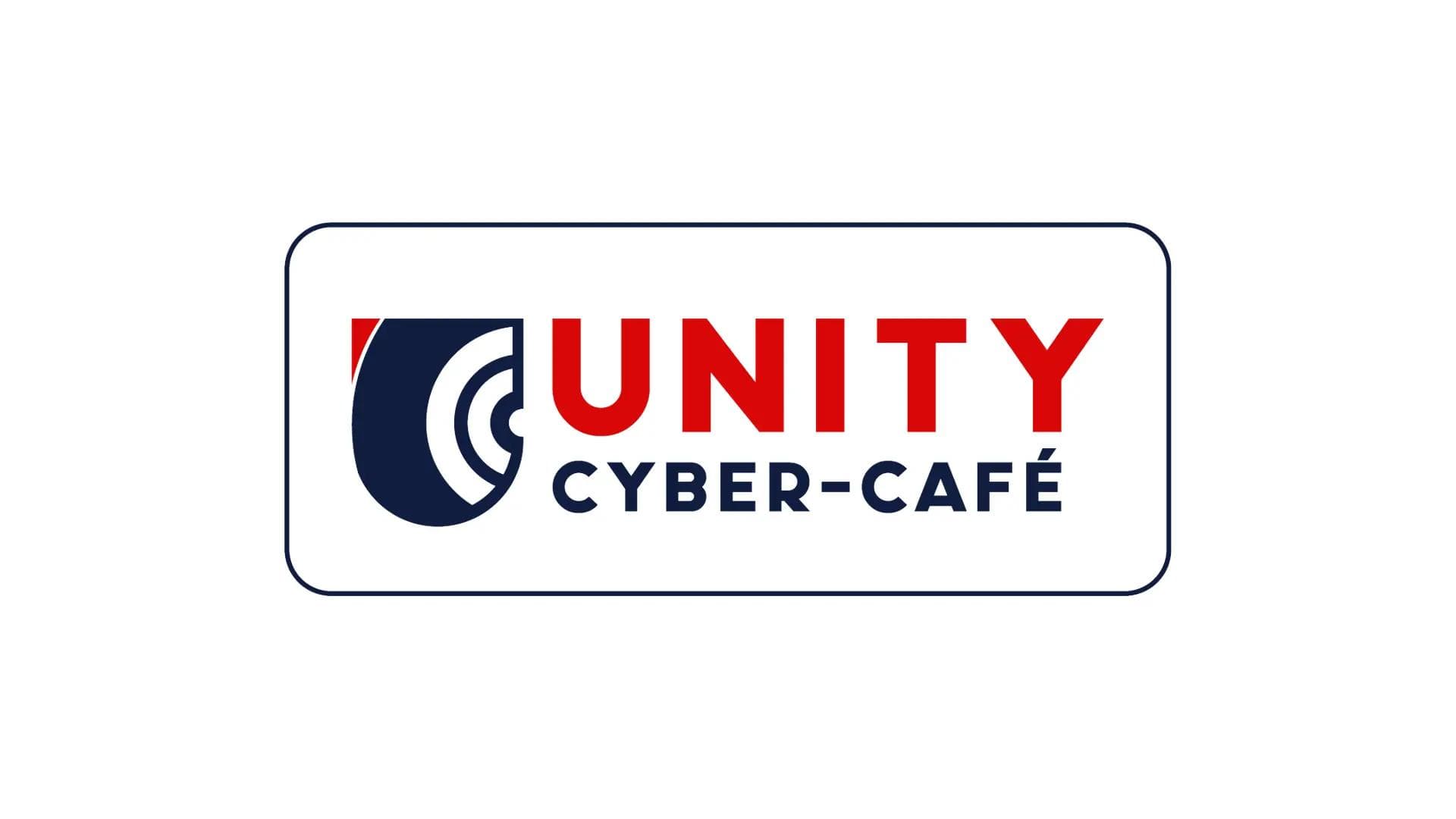
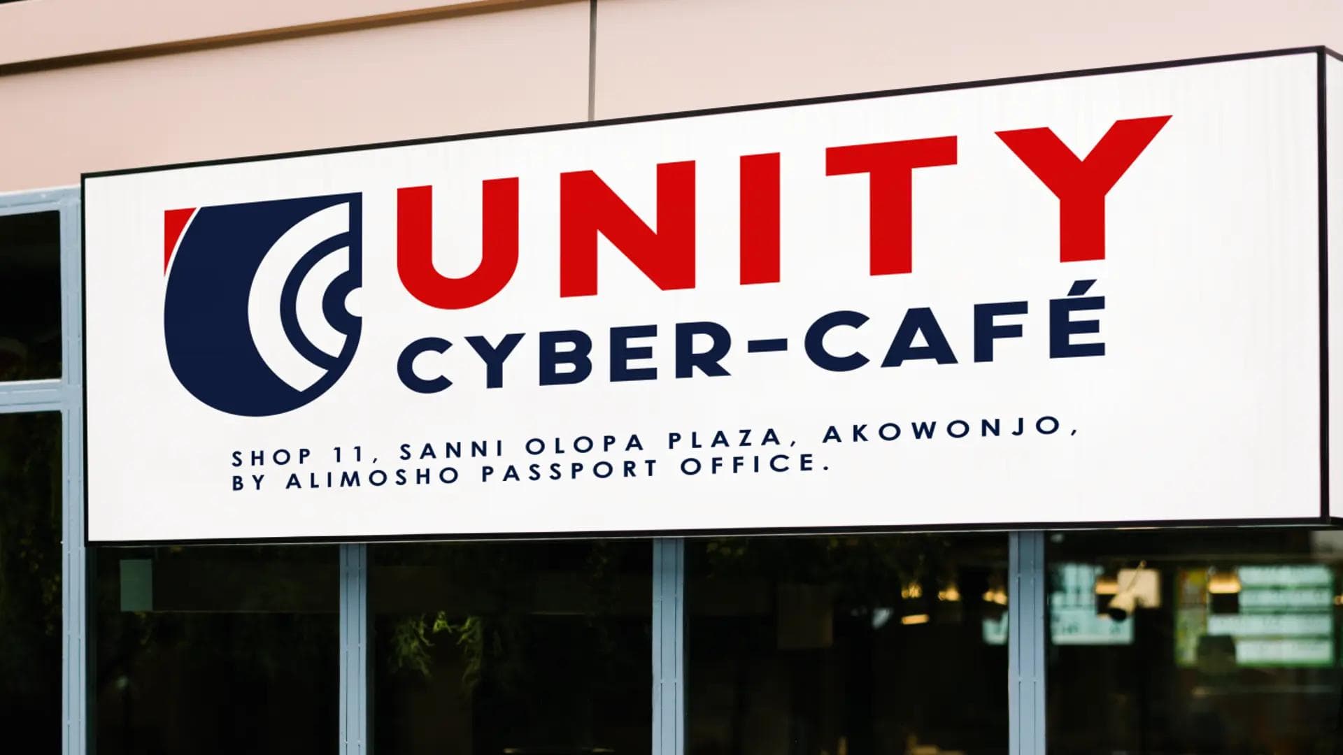
Logo Variations & Scalability
The logo system includes multiple variations to ensure flexibility across all touchpoints, from large-format signage to small digital applications. Each variation maintains clarity and recognizability while adapting to different spatial constraints.
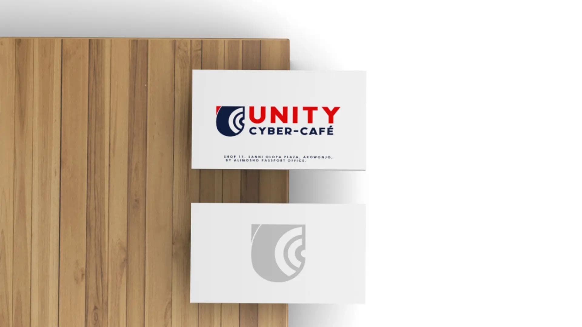
Brand in Use
To demonstrate real-world versatility, the identity was applied across key customer touchpoints, showcasing how the brand performs in practical, everyday environments.
Outcome
Impact & Results
Unity CyberCafe launched with a distinct, professional identity that immediately differentiates it from typical cybercafes. The identity establishes trust from day one and communicates digital competence clearly, positioning the business as organized and reliable, critical for customer confidence when handling sensitive documentation.
Visual Impact
The identity elevates perception, making the business feel structured and legitimate through strategic use of symbolism and restraint.
Brand Readiness
The system is flexible enough to support future expansion into additional services or locations while maintaining consistency.
How the Identity Solves the Initial Problems
- Establishes immediate trust through professional, structured visual language
- Differentiates from generic competitors through strategic symbolism
- Communicates digital competence and security simultaneously
- Remains accessible and approachable to broad audience

What Worked Well
- Early conceptual alignment: Clear communication of brand attributes from the start enabled focused exploration rather than divergent experimentation.
- Strong client collaboration: stakeholder buy-in on the first draft allowed refinement energy to focus on execution quality rather than directional pivots
- Purpose-driven symbolism: Multiple meanings layered into a single mark created richness without visual complexity.